- Windows 10 开发教程
- Windows 10 - 首页
- Windows 10 - 简介
- Windows 10 – UWP
- Windows 10 – 第一个应用
- Windows 10 - 应用商店
- Windows 10 - XAML 控件
- Windows 10 - 数据绑定
- Windows 10 - XAML 性能
- Windows 10 - 自适应设计
- Windows 10 - 自适应UI
- Windows 10 - 自适应代码
- Windows 10 - 文件管理
- Windows 10 - SQLite 数据库
- Windows 10 – 通信
- Windows 10 - 应用本地化
- Windows 10 - 应用生命周期
- Windows 10 - 后台执行
- Windows 10 - 应用服务
- Windows 10 - Web 平台
- Windows 10 - 连接体验
- Windows 10 - 导航
- Windows 10 - 网络
- Windows 10 - 云服务
- Windows 10 - 动态磁贴
- Windows 10 - 共享契约
- Windows 10 - 移植到Windows
- Windows 10 有用资源
- Windows 10 - 快速指南
- Windows 10 - 有用资源
- Windows 10 - 讨论
Windows 10 开发 - 自适应UI
通用 Windows 平台 (UWP) 应用可以在许多不同的设备上运行,而每个设备都有其自身的输入方式、屏幕分辨率、DPI 密度和其他独特特性。
在 Windows 10 中,借助新的通用控件、布局面板和工具,您可以轻松地使您的 UI 适应您的应用程序可能运行的设备。例如,当您的 UWP 应用程序在台式计算机、移动设备或平板电脑上运行时,您可以调整 UI 以利用不同的屏幕分辨率、屏幕尺寸和 DPI 密度。
在 Windows 10 中,您可以使用以下功能轻松地将您的 UI 定向到多个设备:
您可以使用通用控件和布局面板来增强不同屏幕分辨率和屏幕尺寸的 UI。
常见的输入处理允许您通过触摸板、笔、鼠标、键盘或控制器(例如 Microsoft Xbox 控制器)接收输入。
借助工具,您可以设计能够适应不同屏幕分辨率的应用程序 UI。
自适应缩放会根据设备间的分辨率和 DPI 差异进行调整。
在 Windows 10 中,您可以轻松地以任何您想要的方式排列、调整大小和定位应用程序。它还为用户提供一定程度的灵活性,以他们想要的方式使用您的应用程序。在 Windows 10 中,有多种方法可以在您的 UWP 应用程序中实现响应式技术,因此无论屏幕或窗口大小如何,它看起来都很棒。
VisualStateManager
在 Windows 10 中,VisualStateManager 类具有两种新机制,您可以借助它们在 UWP 应用程序中实现响应式设计。新的 VisualState.StateTriggers 允许开发人员检查某些条件(例如窗口高度或窗口宽度),然后 VisualState.Setters API 根据这些特定条件定义视觉状态。
让我们看一下下面给出的示例,其中一些控件添加到堆栈面板中。
<Page
   x:Class = "UWPAdaptiveUI.MainPage"
   xmlns = "http://schemas.microsoft.com/winfx/2006/xaml/presentation"
   xmlns:x = "http://schemas.microsoft.com/winfx/2006/xaml"
   xmlns:local = "using:UWPAdaptiveUI"
   xmlns:d = "http://schemas.microsoft.com/expression/blend/2008"
   xmlns:mc = "http://schemas.openxmlformats.org/markup-compatibility/2006"
   mc:Ignorable = "d">

   <Grid Background = "{ThemeResource ApplicationPageBackgroundThemeBrush}">
      <VisualStateManager.VisualStateGroups>

         <VisualStateGroup>

            <VisualState>

               <VisualState.StateTriggers>
                  <!-- VisualState to be triggered when window
                     width is >=720 effective pixels. -->
                  <AdaptiveTrigger MinWindowWidth = "720" />
               </VisualState.StateTriggers>

               <VisualState.Setters>
                  <Setter Target = "myPanel.Orientation" Value = "Horizontal" />
               </VisualState.Setters>

            </VisualState>

         </VisualStateGroup>

      </VisualStateManager.VisualStateGroups>

      <StackPanel x:Name = "myPanel" Orientation = "Vertical">

         <TextBlock Text = "Windows 10 Tutorials: Text block 1. "
            Style = "{ThemeResource BodyTextBlockStyle}"/>

         <TextBlock Text = "Windows 10 Tutorials: Text block 2. "
            Style = "{ThemeResource BodyTextBlockStyle}"/>

         <TextBlock Text = "Windows 10 Tutorials: Text block 3. "
            Style = "{ThemeResource BodyTextBlockStyle}"/>

      </StackPanel>

   </Grid>

</Page>
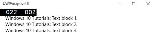
现在 VisualStateManager 将根据窗口的宽度调整堆栈面板的方向。如果宽度 >= 720,则方向将变为水平方向,否则将保持垂直方向。编译并执行上述代码后,您将看到以下窗口,其中包含三个按垂直顺序排列的文本块。
让我们调整上述窗口的宽度,您将看到以下窗口:
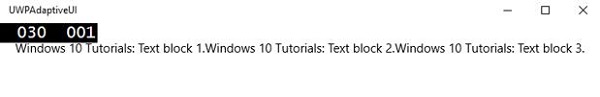
现在您可以看到文本块按水平顺序排列。
RelativePanel
RelativePanel 可用于通过表达元素之间的空间关系来布局 UI 元素。让我们来看一个在相对面板中创建一些矩形的示例。
<Page
   x:Class = "UWPAdaptiveUI.MainPage"
   xmlns = "http://schemas.microsoft.com/winfx/2006/xaml/presentation"
   xmlns:x = "http://schemas.microsoft.com/winfx/2006/xaml"
   xmlns:local = "using:UWPAdaptiveUI"
   xmlns:d = "http://schemas.microsoft.com/expression/blend/2008"
   xmlns:mc = "http://schemas.openxmlformats.org/markup-compatibility/2006"
   mc:Ignorable = "d">

   <Grid Background = "{ThemeResource ApplicationPageBackgroundThemeBrush}">

      <VisualStateManager.VisualStateGroups>

         <VisualStateGroup>

            <VisualState>

               <VisualState.StateTriggers>
                  <AdaptiveTrigger MinWindowWidth = "720" />
               </VisualState.StateTriggers>

               <VisualState.Setters>
                  <Setter Target = "GreenRect.(RelativePanel.RightOf)"
                     Value = "BlueRect" />
                  <Setter Target = "GreenRect.(RelativePanel.AlignRightWithPanel)"
                     Value = "True" />
               </VisualState.Setters>

            </VisualState>

         </VisualStateGroup>

      </VisualStateManager.VisualStateGroups>

      <RelativePanel BorderBrush = "Gray" BorderThickness = "10">
         <Rectangle x:Name = "RedRect" Fill = "Red" MinHeight = "100"
            MinWidth = "100"/>

         <Rectangle x:Name = "BlueRect" Fill = "Blue" MinHeight = "100"
            MinWidth = "100" RelativePanel.RightOf = "RedRect" />

         <!-- Width is not set on the green and yellow rectangles.
            It's determined by the RelativePanel properties. -->

         <Rectangle x:Name = "GreenRect" Fill = "Green" MinHeight = "100"
            RelativePanel.Below = "BlueRect" RelativePanel.AlignLeftWith = "RedRect"
            RelativePanel.AlignRightWith = "BlueRect"/>

         <Rectangle Fill = "Yellow" MinHeight = "100" RelativePanel.Below = "GreenRect"
            RelativePanel.AlignLeftWith = "BlueRect"
            RelativePanel.AlignRightWithPanel = "True"/>

      </RelativePanel>

   </Grid>

</Page>
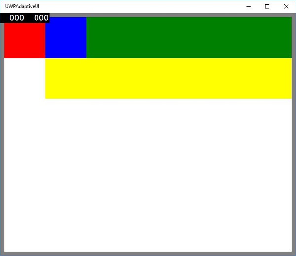
编译并执行上述代码后,您将看到以下窗口。
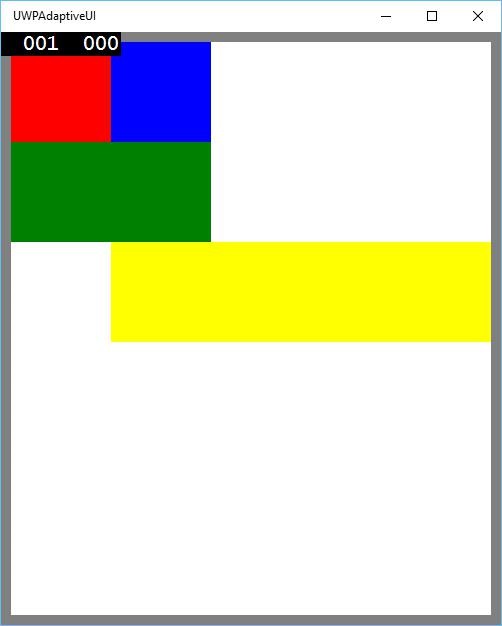
当您调整上述窗口的大小时,您会看到绿色矩形现在调整到蓝色矩形的左上方,如下所示。