- Adobe Flex 教程
- Flex - 首页
- Flex - 概述
- Flex - 环境
- Flex - 应用
- Flex - 创建应用程序
- Flex - 部署应用程序
- Flex - 生命周期阶段
- Flex - 使用 CSS 设置样式
- Flex - 使用皮肤设置样式
- Flex - 数据绑定
- Flex - 基本控件
- Flex - 表单控件
- Flex - 复杂控件
- Flex - 布局面板
- Flex - 视觉效果
- Flex - 事件处理
- Flex - 自定义控件
- Flex - RPC 服务
- Flex - FlexUnit 集成
- Flex - 调试应用程序
- Flex - 国际化
- Flex - 打印支持
- Adobe Flex 资源
- Flex - 快速指南
- Flex - 有用资源
- Flex - 讨论
Flex - 组合框控件
当用户从组合框控件的下拉列表中选择一个项目时,数据项目会显示在控件的提示区域中。
组合框和下拉列表控件之间的一个区别在于,组合框控件的提示区域是使用文本输入控件实现的,而下拉列表控件的提示区域是标签控件。因此,用户可以编辑控件的提示区域以输入一个不是可用选项之一的值。
类声明
以下是spark.components.ComboBox类的声明:
public class ComboBox
   extends DropDownListBase
      implements IIMESupport
公共属性
| 序号 | 属性和描述 |
|---|---|
| 1 | enableIME : 布尔值 [只读] |
| 2 | imeMode : 字符串 |
| 3 | itemMatchingFunction : 函数 = null 指定一个回调函数,用于在用户在提示区域输入字符时搜索项目列表。 |
| 4 | labelToItemFunction : 函数 指定一个回调函数,用于将输入到提示区域的新值转换为与数据提供程序中的数据项相同的数据类型。 |
| 5 | maxChars : 整数 提示区域可以包含的最大字符数(用户输入)。 |
| 6 | openOnInput : 布尔值 = true 如果为 true,则当用户编辑提示区域时,下拉列表将打开。 |
| 7 | prompt : 字符串 如果/当输入文本为空时显示的文本。 |
| 8 | restrict : 字符串 指定用户可以输入到提示区域的字符集。 |
公共方法
| 序号 | 方法和描述 |
|---|---|
| 1 | ComboBox() 构造函数。 |
继承的方法
此类继承自以下类:
- spark.components.supportClasses.DropDownListBase
- spark.components.List
- spark.components.supportClasses.ListBase
- spark.components.SkinnableDataContainer
- spark.components.supportClasses.SkinnableContainerBase
- spark.components.supportClasses.SkinnableComponent
- mx.core.UIComponent
- mx.core.FlexSprite
- flash.display.Sprite
- flash.display.DisplayObjectContainer
- flash.display.InteractiveObject
- flash.display.DisplayObject
- flash.events.EventDispatcher
- Object
Flex 组合框控件示例
让我们按照以下步骤,通过创建一个测试应用程序来检查在 Flex 应用程序中组合框控件的使用:
| 步骤 | 描述 |
|---|---|
| 1 | 如“Flex - 创建应用程序”一章所述,创建一个名为HelloWorld的项目,该项目位于包com.tutorialspoint.client下。 |
| 2 | 修改HelloWorld.mxml,如下所述。保持其余文件不变。 |
| 3 | 编译并运行应用程序,以确保业务逻辑按要求工作。 |
以下是修改后的 mxml 文件src/com.tutorialspoint/HelloWorld.mxml的内容
<?xml version = "1.0" encoding = "utf-8"?>
<s:Application xmlns:fx = "http://ns.adobe.com/mxml/2009"
   xmlns:s = "library://ns.adobe.com/flex/spark"
   xmlns:mx = "library://ns.adobe.com/flex/mx"
   width = "100%" height = "100%" minWidth = "500" minHeight = "500">

   <fx:Style source = "/com/tutorialspoint/client/Style.css" />
   <fx:Script>
      <![CDATA[
         import mx.collections.ArrayCollection;

         [Bindable]
         public var data:ArrayCollection = new ArrayCollection (
         [
            {value:"France", code:"FR"},
            {value:"Japan", code:"JP"},
            {value:"India", code:"IN"},
            {value:"Russia", code:"RS"},
            {value:"United States", code:"US"}
         ]
         );

         private function mappingFunction(input:String):Object {
            switch (input){
               case "France":
                  return {value:input, code:"FR"};
               case "Japan":
                  return {value:input, code:"JP"};
               case "India":
                  return {value:input, code:"IN"};
               case "Russia":
                  return {value:input, code:"RS"};
               case "United States":
                  return {value:input, code:"US"};
            }
            return null;
         }

      ]]>
   </fx:Script>

   <fx:Declarations>
      <mx:DateFormatter id = "dateFormatter" />
   </fx:Declarations>

   <s:BorderContainer width = "550" height = "400" id = "mainContainer"
      styleName = "container">
      <s:VGroup width = "100%" height = "100%" gap = "50" horizontalAlign = "center"
         verticalAlign = "middle">
         <s:Label id = "lblHeader" text = "Form Controls Demonstration"
            fontSize = "40" color = "0x777777" styleName = "heading" />

         <s:Panel id = "comboBoxPanel" title = "Using ComboBox" width = "420"
            height = "200">
         <s:layout>
            <s:VerticalLayout  gap = "10" verticalAlign = "middle"
               horizontalAlign = "center" />
         </s:layout>

         <s:HGroup>
            <s:Label text = "Index :" /> <s:Label
               text = "{comboBox.selectedIndex}" fontWeight = "bold" />
            <s:Label text = "Value :" /> <s:Label
               text = "{comboBox.selectedItem.value}" fontWeight = "bold" />
            <s:Label text = "Code :" /> <s:Label
               text = "{comboBox.selectedItem.code}" fontWeight = "bold" />
         </s:HGroup>

         <s:ComboBox  id = "comboBox"  dataProvider = "{data}" width = "150"
            labelToItemFunction = "{mappingFunction}" selectedIndex = "0"
            labelField = "value" />
         </s:Panel>
      </s:VGroup>
   </s:BorderContainer>
</s:Application>
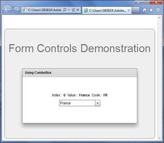
完成所有更改后,让我们像在Flex - 创建应用程序章节中那样,以普通模式编译并运行应用程序。如果应用程序一切正常,它将产生以下结果:[ 在线试用 ]
flex_form_controls.htm
广告