- Plotly 教程
- Plotly - 首页
- Plotly - 简介
- Plotly - 环境设置
- Plotly - 在线和离线绘图
- 在 Jupyter Notebook 中内联绘图
- Plotly - 包结构
- Plotly - 导出为静态图像
- Plotly - 图例
- Plotly - 格式化坐标轴和刻度
- Plotly - 子图和嵌入图
- Plotly - 条形图和饼图
- Plotly - 散点图、Scattergl 图和气泡图
- Plotly - 点图和表格
- Plotly - 直方图
- Plotly - 箱线图、小提琴图和等值线图
- Plotly - Distplots、密度图和误差条形图
- Plotly - 热力图
- Plotly - 极坐标图和雷达图
- Plotly - OHLC 图、瀑布图和漏斗图
- Plotly - 3D 散点图和曲面图
- Plotly - 添加按钮/下拉菜单
- Plotly - 滑块控件
- Plotly - FigureWidget 类
- Plotly 与 Pandas 和 Cufflinks
- Plotly 与 Matplotlib 和 Chart Studio
- Plotly 有用资源
- Plotly - 快速指南
- Plotly - 有用资源
- Plotly - 讨论
Plotly - 格式化坐标轴和刻度
您可以通过指定线宽和颜色来配置每个坐标轴的外观。还可以定义网格宽度和网格颜色。让我们在本节中详细了解一下。
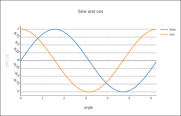
带有坐标轴和刻度的绘图
在 Layout 对象的属性中,将 showticklabels 设置为 true 将启用刻度。tickfont 属性是一个字典对象,指定字体名称、大小、颜色等。tickmode 属性可以有两个可能的值 - linear 和 array。如果它是线性,则起始刻度的位置由 tick0 属性确定,刻度之间的步长由 dtick 属性确定。
如果 tickmode 设置为 array,则必须提供值和标签列表作为 tickval 和 ticktext 属性。
Layout 对象还具有 Exponentformat 属性,将其设置为 ‘e’ 将导致刻度值以科学计数法显示。您还需要将 showexponent 属性设置为 ‘all’。
我们现在在上面的示例中格式化 Layout 对象,通过指定线、网格和标题字体属性以及刻度模式、值和字体来配置 x 和 y 轴。
layout = go.Layout(
   title = "Sine and cos",
   xaxis = dict(
      title = 'angle',
      showgrid = True,
      zeroline = True,
      showline = True,
      showticklabels = True,
      gridwidth = 1
   ),
   yaxis = dict(
      showgrid = True,
      zeroline = True,
      showline = True,
      gridcolor = '#bdbdbd',
      gridwidth = 2,
      zerolinecolor = '#969696',
      zerolinewidth = 2,
      linecolor = '#636363',
      linewidth = 2,
      title = 'VALUE',
      titlefont = dict(
         family = 'Arial, sans-serif',
         size = 18,
         color = 'lightgrey'
      ),
      showticklabels = True,
      tickangle = 45,
      tickfont = dict(
      family = 'Old Standard TT, serif',
      size = 14,
      color = 'black'
      ),
      tickmode = 'linear',
      tick0 = 0.0,
      dtick = 0.25
   )
)
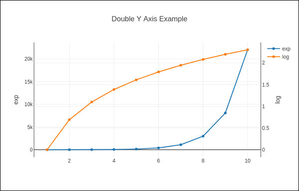
具有多个坐标轴的绘图
有时在图形中使用双 x 或 y 轴很有用;例如,当将具有不同单位的曲线一起绘制时。Matplotlib 使用 twinx 和 twiny 函数支持此功能。在以下示例中,该图具有 双 y 轴,一个显示 exp(x),另一个显示 log(x)
x = np.arange(1,11)
y1 = np.exp(x)
y2 = np.log(x)
trace1 = go.Scatter(
   x = x,
   y = y1,
   name = 'exp'
)
trace2 = go.Scatter(
   x = x,
   y = y2,
   name = 'log',
   yaxis = 'y2'
)
data = [trace1, trace2]
layout = go.Layout(
   title = 'Double Y Axis Example',
   yaxis = dict(
      title = 'exp',zeroline=True,
      showline = True
   ),
   yaxis2 = dict(
      title = 'log',
      zeroline = True,
      showline = True,
      overlaying = 'y',
      side = 'right'
   )
)
fig = go.Figure(data=data, layout=layout)
iplot(fig)
在此,其他 y 轴配置为 yaxis2 并出现在右侧,标题为 ‘log’。结果图如下所示:
广告