- Plotly 教程
- Plotly - 首页
- Plotly - 简介
- Plotly - 环境设置
- Plotly - 在线和离线绘图
- 在 Jupyter Notebook 中内联绘图
- Plotly - 包结构
- Plotly - 导出为静态图像
- Plotly - 图例
- Plotly - 格式化坐标轴和刻度
- Plotly - 子图和内嵌图
- Plotly - 条形图和饼图
- Plotly - 散点图、Scattergl 图和气泡图
- Plotly - 点图和表格
- Plotly - 直方图
- Plotly - 箱线图、小提琴图和等高线图
- Plotly - 分布图、密度图和误差条图
- Plotly - 热力图
- Plotly - 极坐标图和雷达图
- Plotly - OHLC 图、瀑布图和漏斗图
- Plotly - 3D 散点图和曲面图
- Plotly - 添加按钮/下拉菜单
- Plotly - 滑块控件
- Plotly - FigureWidget 类
- Plotly 与 Pandas 和 Cufflinks
- Plotly 与 Matplotlib 和 Chart Studio
- Plotly 有用资源
- Plotly - 快速指南
- Plotly - 有用资源
- Plotly - 讨论
散点图、Scattergl 图和气泡图
本章重点介绍散点图、Scattergl 图和气泡图的详细信息。首先,让我们学习散点图。
散点图
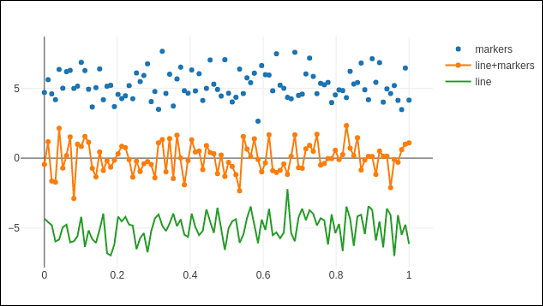
散点图用于在水平和垂直轴上绘制数据点,以显示一个变量如何影响另一个变量。数据表中的每一行都由一个标记表示,其位置取决于在X和Y轴上设置的列中的值。
graph_objs 模块的scatter()方法(go.Scatter)生成散点轨迹。这里,mode属性决定数据点的外观。mode的默认值为lines,显示连接数据点的连续线。如果设置为markers,则仅显示由小实心圆表示的数据点。当mode赋值为“lines+markers”时,圆和线都将显示。
在下面的示例中,绘制了笛卡尔坐标系中三组随机生成的点的散点轨迹。下面解释了每个具有不同mode属性的轨迹。
import numpy as np
N = 100
x_vals = np.linspace(0, 1, N)
y1 = np.random.randn(N) + 5
y2 = np.random.randn(N)
y3 = np.random.randn(N) - 5
trace0 = go.Scatter(
   x = x_vals,
   y = y1,
   mode = 'markers',
   name = 'markers'
)
trace1 = go.Scatter(
   x = x_vals,
   y = y2,
   mode = 'lines+markers',
   name = 'line+markers'
)
trace2 = go.Scatter(
   x = x_vals,
   y = y3,
   mode = 'lines',
   name = 'line'
)
data = [trace0, trace1, trace2]
fig = go.Figure(data = data)
iplot(fig)
Jupyter Notebook 单元格的输出如下所示:
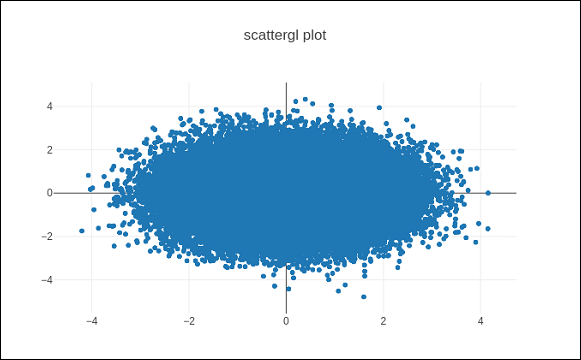
Scattergl 图
WebGL(Web 图形库)是一个 JavaScript API,用于在任何兼容的 Web 浏览器中渲染交互式2D和3D 图形,无需使用插件。WebGL 与其他 Web 标准完全集成,允许使用图形处理单元 (GPU) 加速图像处理。
在 Plotly 中,您可以使用Scattergl()代替Scatter()来实现 WebGL,以提高速度、改进交互性和绘制更多数据的能力。go.scattergl()函数在涉及大量数据点时具有更好的性能。
import numpy as np
N = 100000
x = np.random.randn(N)
y = np.random.randn(N)
   trace0 = go.Scattergl(
   x = x, y = y, mode = 'markers'
)
data = [trace0]
layout = go.Layout(title = "scattergl plot ")
fig = go.Figure(data = data, layout = layout)
iplot(fig)
输出如下所示:
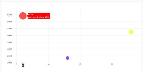
气泡图
气泡图显示数据的三个维度。每个具有三个关联数据维度的实体都绘制为一个圆盘(气泡),该圆盘通过圆盘的xy 位置表达两个维度,并通过其大小表达第三个维度。气泡的大小由第三个数据系列中的值决定。
气泡图是散点图的一种变体,其中数据点被气泡代替。如果您的数据具有如下所示的三个维度,则创建气泡图将是一个不错的选择。
| 公司 | 产品 | 销售额 | 市场份额 |
|---|---|---|---|
| A | 13 | 2354 | 23 |
| B | 6 | 5423 | 47 |
| C | 23 | 2451 | 30 |
气泡图是用go.Scatter()轨迹生成的。上述数据系列中的两个作为x和y属性给出。第三个维度由标记显示,其大小代表第三个数据系列。在上述情况下,我们使用产品和销售额作为x和y属性,市场份额作为标记大小。
在 Jupyter Notebook 中输入以下代码。
company = ['A','B','C']
products = [13,6,23]
sale = [2354,5423,4251]
share = [23,47,30]
fig = go.Figure(data = [go.Scatter(
   x = products, y = sale,
   text = [
      'company:'+c+' share:'+str(s)+'%'
      for c in company for s in share if company.index(c)==share.index(s)
   ],
   mode = 'markers',
   marker_size = share, marker_color = ['blue','red','yellow'])
])
iplot(fig)
输出将如下所示: