- Ngx-Bootstrap 教程
- Ngx-Bootstrap - 首页
- Ngx-Bootstrap - 概述
- Ngx-Bootstrap - 环境设置
- Ngx-Bootstrap - 手风琴
- Ngx-Bootstrap - 警报
- Ngx-Bootstrap - 按钮
- Ngx-Bootstrap - 走马灯
- Ngx-Bootstrap - 折叠
- Ngx-Bootstrap - 日期选择器
- Ngx-Bootstrap - 下拉菜单
- Ngx-Bootstrap - 模态框
- Ngx-Bootstrap - 分页
- Ngx-Bootstrap - 气泡提示
- Ngx-Bootstrap - 进度条
- Ngx-Bootstrap - 评分
- Ngx-Bootstrap - 可排序
- Ngx-Bootstrap - 标签页
- Ngx-Bootstrap - 时间选择器
- Ngx-Bootstrap - 工具提示
- Ngx-Bootstrap - 自动完成
- Ngx-Bootstrap 有用资源
- Ngx-Bootstrap - 快速指南
- Ngx-Bootstrap - 有用资源
- Ngx-Bootstrap - 讨论
Ngx-Bootstrap - 折叠
ngx-bootstrap Collapse 指令有助于显示/隐藏容器内容。
CollapseDirective
选择器
[collapse]
输入
collapse − 布尔值,指示内容可见性(显示或隐藏)的标志
display − 字符串
isAnimated − 布尔值,开启/关闭动画。默认值:false
输出
collapsed − 内容折叠后立即触发此事件
collapses − 开始折叠时触发此事件
expanded − 内容可见后立即触发此事件
expands − 开始展开时触发此事件
方法
toggle() − 允许手动切换内容可见性
hide − 允许手动隐藏内容
show − 允许手动显示已折叠的内容
示例
由于我们将使用折叠功能,因此需要更新 ngx-bootstrap 走马灯 章节中使用的 app.module.ts 文件,以使用 CollapseModule。
更新 app.module.ts 以使用 CollapseModule。
app.module.ts
import { BrowserModule } from '@angular/platform-browser';
import { NgModule } from '@angular/core';
import { BrowserAnimationsModule } from '@angular/platform-browser/animations';
import { AppComponent } from './app.component';
import { TestComponent } from './test/test.component';
import { AccordionModule } from 'ngx-bootstrap/accordion';
import { AlertModule,AlertConfig } from 'ngx-bootstrap/alert';
import { ButtonsModule } from 'ngx-bootstrap/buttons';
import { FormsModule } from '@angular/forms';
import { CarouselModule } from 'ngx-bootstrap/carousel';
import { CollapseModule } from 'ngx-bootstrap/collapse';

@NgModule({
   declarations: [
      AppComponent,
      TestComponent
   ],
   imports: [
      BrowserAnimationsModule,
      BrowserModule,
      AccordionModule,
      AlertModule,
      ButtonsModule,
      FormsModule,
      CarouselModule,
      CollapseModule
   ],
   providers: [AlertConfig],
   bootstrap: [AppComponent]
})
export class AppModule { }
更新 test.component.html 以使用 Collapse。
test.component.html
<div>
   <div class="checkbox">
      <label><input type="checkbox" [(ngModel)]="isCollapsed">Collapse</label>
   </div>
</div>
<div [collapse]="isCollapsed" [isAnimated]="true">
   <div class="well well-lg card card-block card-header">Welcome to Tutorialspoint.</div>
</div>
更新 test.component.ts 以对应变量和方法。
test.component.ts
import { Component, OnInit } from '@angular/core';

@Component({
   selector: 'app-test',
   templateUrl: './test.component.html',
   styleUrls: ['./test.component.css']
})
export class TestComponent implements OnInit {
   isCollapsed: boolean = false;
   constructor() { }

   ngOnInit(): void {
   }
}
构建和运行
运行以下命令启动 Angular 服务器。
ng serve
服务器启动并运行后,打开 https://:4200 并验证以下输出。
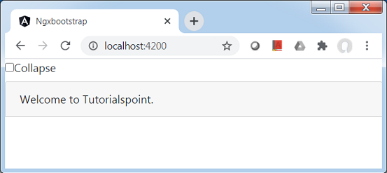
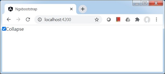
选中折叠复选框,然后内容将被折叠。
广告