- ngx-bootstrap 教程
- ngx-bootstrap - 首页
- ngx-bootstrap - 概述
- ngx-bootstrap - 环境设置
- ngx-bootstrap - 手风琴
- ngx-bootstrap - 警报
- ngx-bootstrap - 按钮
- ngx-bootstrap - 走马灯
- ngx-bootstrap - 折叠面板
- ngx-bootstrap - 日期选择器
- ngx-bootstrap - 下拉菜单
- ngx-bootstrap - 模态框
- ngx-bootstrap - 分页
- ngx-bootstrap - 气泡提示框
- ngx-bootstrap - 进度条
- ngx-bootstrap - 评分
- ngx-bootstrap - 可排序列表
- ngx-bootstrap - 标签页
- ngx-bootstrap - 时间选择器
- ngx-bootstrap - 工具提示框
- ngx-bootstrap - 自动完成
- ngx-bootstrap 有用资源
- ngx-bootstrap - 快速指南
- ngx-bootstrap - 有用资源
- ngx-bootstrap - 讨论
ngx-bootstrap - 气泡提示框
ngx-bootstrap popover 组件提供了一个小的覆盖层组件,用于提供关于组件的小信息。
PopoverDirective
选择器
popover
输入
adaptivePosition − 布尔值,设置禁用自适应位置。
container − 字符串,指定应将气泡提示框附加到的元素的选择器。
containerClass − 字符串,气泡提示框容器的 CSS 类。
delay − 数字,显示工具提示之前的延迟。
isOpen − 布尔值,返回气泡提示框当前是否正在显示。
outsideClick − 布尔值,单击外部时关闭气泡提示框,默认值:false。
placement − "top" | "bottom" | "left" | "right" | "auto" | "top left" | "top right" | "right top" | "right bottom" | "bottom right" | "bottom left" | "left bottom" | "left top",气泡提示框的位置。接受:"top","bottom","left","right"。
popover − 字符串 | TemplateRef<any>,要显示为气泡提示框的内容。
popoverContext − any,如果气泡提示框是模板,则要使用的上下文。
popoverTitle − 字符串,气泡提示框的标题。
triggers − 字符串,指定应触发的事件。支持以空格分隔的事件名称列表。
输出
onHidden − 当气泡提示框隐藏时发出事件。
onShown − 当气泡提示框显示时发出事件。
方法
setAriaDescribedBy() − 为元素指令设置 aria-describedBy 属性,并为气泡提示框设置 ID。
show() − 打开元素的气泡提示框。这被认为是气泡提示框的“手动”触发。
hide() − 关闭元素的气泡提示框。这被认为是气泡提示框的“手动”触发。
toggle() − 切换元素的气泡提示框。这被认为是气泡提示框的“手动”触发。
示例
由于我们将使用气泡提示框,因此我们必须更新在ngx-bootstrap 分页章节中使用的 app.module.ts,以使用PopoverModule 和 PopoverConfig。
更新 app.module.ts 以使用 PopoverModule 和 PopoverConfig。
app.module.ts
import { BrowserModule } from '@angular/platform-browser';
import { NgModule } from '@angular/core';
import { BrowserAnimationsModule } from '@angular/platform-browser/animations';
import { AppComponent } from './app.component';
import { TestComponent } from './test/test.component';
import { AccordionModule } from 'ngx-bootstrap/accordion';
import { AlertModule,AlertConfig } from 'ngx-bootstrap/alert';
import { ButtonsModule } from 'ngx-bootstrap/buttons';
import { FormsModule } from '@angular/forms';
import { CarouselModule } from 'ngx-bootstrap/carousel';
import { CollapseModule } from 'ngx-bootstrap/collapse';
import { BsDatepickerModule, BsDatepickerConfig } from 'ngx-bootstrap/datepicker';
import { BsDropdownModule,BsDropdownConfig } from 'ngx-bootstrap/dropdown';
import { PaginationModule,PaginationConfig } from 'ngx-bootstrap/pagination';
import { PopoverModule, PopoverConfig } from 'ngx-bootstrap/popover';

@NgModule({
   declarations: [
      AppComponent,
      TestComponent
   ],
   imports: [
      BrowserAnimationsModule,
      BrowserModule,
      AccordionModule,
      AlertModule,
      ButtonsModule,
      FormsModule,
      CarouselModule,
      CollapseModule,
      BsDatepickerModule.forRoot(),
      BsDropdownModule,
      ModalModule,
      PaginationModule,
      PopoverModule
   ],
   providers: [AlertConfig,
      BsDatepickerConfig,
      BsDropdownConfig,
      BsModalService,
      PaginationConfig],
   bootstrap: [AppComponent]
})
export class AppModule { }
更新 test.component.html 以使用模态框。
test.component.html
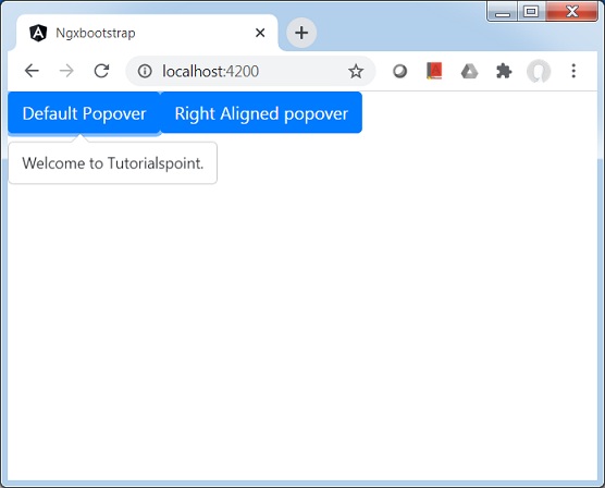
<button type="button" class="btn btn-default btn-primary"
   popover="Welcome to Tutorialspoint." [outsideClick]="true">
   Default Popover
</button>
<button type="button" class="btn btn-default btn-primary"
   popover="Welcome to Tutorialspoint."
   popoverTitle="Tutorialspoint"
   [outsideClick]="true"
   placement="right">
   Right Aligned popover
</button>
更新 test.component.ts 以对应变量和方法。
test.component.ts
import { Component, OnInit } from '@angular/core';
import { BsModalService } from 'ngx-bootstrap/modal';
import { PageChangedEvent } from 'ngx-bootstrap/pagination';

@Component({
   selector: 'app-test',
   templateUrl: './test.component.html',
   styleUrls: ['./test.component.css']
})
export class TestComponent implements OnInit {
   constructor() {}
   ngOnInit(): void {
   }
}
构建和运行
运行以下命令启动 Angular 服务器。
ng serve
服务器启动并运行后。打开 https://:4200。单击“打开模态框”按钮并验证以下输出。