- Google AMP 教程
- Google AMP - 首页
- Google AMP - 概述
- Google AMP - 简介
- Google AMP - 图片
- Google AMP - 表单
- Google AMP - 内嵌框架 (Iframes)
- Google AMP - 视频
- Google AMP - 按钮
- Google AMP - Timeago (时间显示)
- Google AMP - MathML (数学标记语言)
- Google AMP - 自适应文本 (Fit Text)
- Google AMP - 日期倒计时
- Google AMP - 日期选择器
- Google AMP - 故事 (Story)
- Google AMP - 选择器
- Google AMP - 链接
- Google AMP - 字体
- Google AMP - 列表
- Google AMP - 用户通知
- Google AMP - 下一页
- Google AMP - 属性
- 样式和自定义 CSS
- Google AMP - 动态 CSS 类
- Google AMP - 动作和事件
- Google AMP - 动画
- Google AMP - 数据绑定
- Google AMP - 布局
- Google AMP - 广告
- Google AMP - 分析
- Google AMP - 社交插件
- Google AMP - 媒体
- HTML 页面转换为 AMP 页面
- Google AMP - 基本语法
- Google AMP - 验证
- Google AMP - 缓存
- Google AMP - 自定义 JavaScript
- Google AMP - CORS (跨域资源共享)
- Google AMP 有用资源
- Google AMP - 快速指南
- Google AMP - 有用资源
- Google AMP - 讨论
Google AMP - 属性
本章将讨论 amp 组件使用的所有常用属性。
常用属性列表如下:
- fallback (备用)
- heights (高度)
- layout (布局)
- media (媒体)
- noloading (不显示加载)
- on (事件)
- placeholder (占位符)
- sizes (尺寸)
- width and height (宽度和高度)
fallback 属性
当浏览器不支持使用的元素或在文件加载时出现问题或文件使用错误时,主要使用 fallback 属性。
例如,您正在使用 amp-video,并且媒体文件在浏览器上出现问题,在这种情况下,我们可以指定 fallback 属性并显示一条消息,说明媒体文件无法播放或浏览器不支持,而不是在页面上显示错误消息。
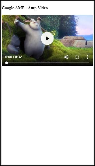
在 amp-video 中使用 Fallback
<amp-video controls
   width = "640"
   height = "360"
   layout = "responsive"
   poster = "images/videoposter.png">
   <source src = "video/bunny.webm" type = "video/webm" />
   <source src = "video/samplevideo.mp4" type = "video/mp4" />
   <div fallback>
      <p>This browser does not support the video element.</p>
   </div>
</amp-video>
让我们通过一个例子来了解 fallback 的工作原理:
示例
<!doctype html>
<html amp lang = "en">
   <head>
      <meta charset = "utf-8">
      <script async src = "https://cdn.ampproject.org/v0.js"></script>
      <title>Google AMP - Amp Video</title>
      <link rel = "canonical" href = "      http://example.ampproject.org/article-metadata.html">
      <meta name = "viewport" content = "width = device-width,minimum-scale = 1,initial-scale = 1">

      <style amp-boilerplate>
         body{
            -webkit-animation:
            -amp-start 8s steps(1,end) 0s 1 normal both;-moz-animation:
            -amp-start 8s steps(1,end) 0s 1 normal both;-ms-animation:
            -amp-start 8s steps(1,end) 0s 1 normal both;animation:
            -amp-start 8s steps(1,end) 0s 1 normal both
         }
         @-webkit-keyframes
         -amp-start{from{visibility:hidden}to{visibility:visible}}@-moz-keyframes
         -amp-start{from{visibility:hidden}to{visibility:visible}}@-ms-keyframes
         -amp-start{from{visibility:hidden}to{visibility:visible}}@-o-keyframes
         -amp-start{from{visibility:hidden}to{visibility:visible}}@keyframes
         -amp-start{from{visibility:hidden}to{visibility:visible}}
      </style>

      <noscript>
         <style amp-boilerplate>
            body{
               -webkit-animation:none;-moz-animation:none;
               -ms-animation:none;animation:none
            }
         </style>
      </noscript>

      <script async custom-element = "amp-video"
         src = "https://cdn.ampproject.org/v0/amp-video-0.1.js">
      </script>
   </head>
   <body>
      <h3>Google AMP - Amp Video</h3>
      <amp-video controls
         width = "640"
         height = "360"
         layout = "responsive"
         poster = "images/videoposter.png">
         <source src = "video/bunny.webm"type="video/webm" />
         <source src = "video/samplevideo.mp4"type = "video/mp4" />
         <div fallback>
            <p>This browser does not support the video element.</p>
         </div>
      </amp-video>
   </body>
</html>
输出
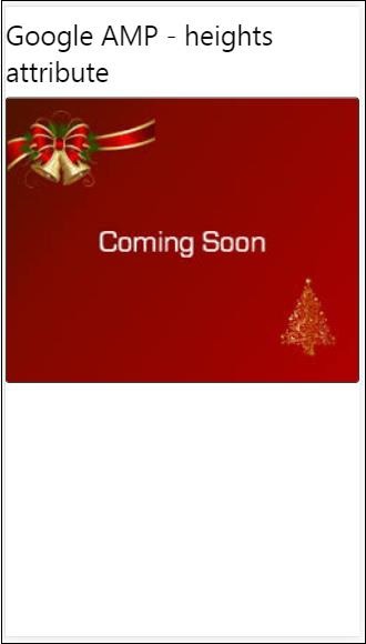
Heights 属性
此属性主要支持响应式布局。您可以对 heights 属性使用媒体表达式,它应用于元素的高度。它也采用百分比值,因此高度是根据给定的百分比宽度计算的。
示例
<!doctype html>
<html amp lang = "en">
   <head>
      <meta charset = "utf-8">
      <script async src = "https://cdn.ampproject.org/v0.js"></script>
      <title>Google AMP - heights attribute</title>
      <link rel = "canonical" href = "http://example.ampproject.org/article-metadata.html">
      <meta name = "viewport" content = "width=device-width,minimum-scale = 1,initial-scale = 1">

      <style amp-boilerplate>
         body{
            -webkit-animation:
            -amp-start 8s steps(1,end) 0s 1 normal both;-moz-animation:
            -amp-start 8s steps(1,end) 0s 1 normal both;-ms-animation:
            -amp-start 8s steps(1,end) 0s 1 normal both;animation:
            -amp-start 8s steps(1,end) 0s 1 normal both
         }
         @-webkit-keyframes
         -amp-start{from{visibility:hidden}to{visibility:visible}}@-moz-keyframes
         -amp-start{from{visibility:hidden}to{visibility:visible}}@-ms-keyframes
         -amp-start{from{visibility:hidden}to{visibility:visible}}@-o-keyframes
         -amp-start{from{visibility:hidden}to{visibility:visible}}@keyframes
         -amp-start{from{visibility:hidden}to{visibility:visible}}
      </style>

      <noscript>
         <style amp-boilerplate>
            body{
               -webkit-animation:none;-moz-animation:none;
               -ms-animation:none;animation:none
            }
         </style>
      </noscript>

      <style amp-custom>
         amp-img {
            border: 1px solid black;
            border-radius: 4px;
            padding: 5px;
         }
         h1{font-family: "Segoe UI",Arial,sans-serif;font-weight: 400;margin: 10px 0;}
      </style>
   </head>
   <body>
      <h1>Google AMP - heights attribute</h1>
      <amp-img src = "images/christmas1.jpg"
         width = "320" height = "256"
         heights = "(min-width:500px) 200px, 80%">
      </amp-img>
   </body>
</html>
输出
layout 属性
AMP 布局是 google-amp 中一项重要的功能。AMP 布局确保在页面加载时正确渲染 amp 组件,而不会导致任何闪烁或滚动问题。它还在执行任何其他远程资源(如图片的 http 请求、数据调用)之前检查页面渲染。
amp 支持的布局列表如下:
- 不存在
- Container (容器)
- fill (填充)
- fixed (固定)
- fixed-height (固定高度)
- flex-item (弹性项目)
- intrinsic (内在)
- nodisplay (不显示)
- Responsive (响应式)
您将在本教程的 **Google AMP - 布局** 章中详细了解。
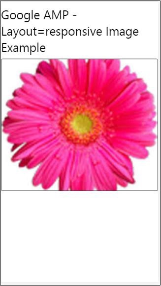
让我们通过以下示例了解 layout=”responsive” 的工作原理:
示例
<!doctype html>
<html amp lang = "en">
   <head>
      <meta charset = "utf-8">
      <script async src = "https://cdn.ampproject.org/v0.js"></script>
      <title>Google AMP - Image>/title>
      <link rel = "canonical" href = "      http://example.ampproject.org/article-metadata.html">
      <meta name = "viewport" content = "width = device-width,minimum-scale = 1,initial-scale = 1">

      <style amp-boilerplate>
         body {
            -webkit-animation:
            -amp-start 8s steps(1,end) 0s 1 normal both;-moz-animation:
            -amp-start 8s steps(1,end) 0s 1 normal both;-ms-animation:
            -amp-start 8s steps(1,end) 0s 1 normal both;animation:
            -amp-start 8s steps(1,end) 0s 1 normal both
         }
         @-webkit-keyframes
         -amp-start{from{visibility:hidden}to{visibility:visible}}@-moz-keyframes
         -amp-start{from{visibility:hidden}to{visibility:visible}}@-ms-keyframes
         -amp-start{from{visibility:hidden}to{visibility:visible}}@-o-keyframes
         -amp-start{from{visibility:hidden}to{visibility:visible}}@keyframes
         -amp-start{from{visibility:hidden}to{visibility:visible}}
      </style>

      <noscript>
         <style amp-boilerplate>
            body {
               -webkit-animation:none;-moz-animation:none;
               -ms-animation:none;animation:none
            }
         </style>
      </noscript>

      <style amp-custom>
         amp-img {
            border: 1px solid black;
            border-radius: 4px;
            padding: 5px;
         }
         displayitem {
            display: inline-block;
            width: 200px;
            height:200px;
            margin: 5px;
         }
         h1{font-family: "Segoe
         UI",Arial,sans-serif;font-weight: 400;margin: 10px 0;}
      </style>
   </head>
   <body>
      <h1>Google AMP - Layout = responsive Image Example>/h1>
      <div class = "displayitem">
         <amp-img alt = "Beautiful Flower"
            src = "images/flower.jpg"
            width = "246"
            height = "205"
            layout = "responsive">
         </amp-img>
      </div>
   </body>
</html>
输出
Media 属性
此属性可用于大多数 amp 组件。它采用媒体查询,如果值与组件不匹配,则不会渲染该组件。
让我们通过一个例子来了解 media 属性的工作原理:
示例
<!doctype html>
<html amp lang = "en">
   <head>
      <meta charset = "utf-8">
      <script async src = "https://cdn.ampproject.org/v0.js"></script>
      <title>Google AMP - Image</title>
      <link rel = "canonical" href = " http://example.ampproject.org/article-metadata.html">
      <meta name = "viewport" content = "width = device-width,minimum-scale = 1,initial-scale = 1">

      <style amp-boilerplate>
         body{
            -webkit-animation:
            -amp-start 8s steps(1,end) 0s 1 normal both;-moz-animation:
            -amp-start 8s steps(1,end) 0s 1 normal both;-ms-animation:
            -amp-start 8s steps(1,end) 0s 1 normal both;animation:
            -amp-start 8s steps(1,end) 0s 1 normal both
         }
         @-webkit-keyframes
         -amp-start{from{visibility:hidden}to{visibility:visible}}@-moz-keyframes
         -amp-start{from{visibility:hidden}to{visibility:visible}}@-ms-keyframes
         -amp-start{from{visibility:hidden}to{visibility:visible}}@-o-keyframes
         -amp-start{from{visibility:hidden}to{visibility:visible}}@keyframes
         -amp-start{from{visibility:hidden}to{visibility:visible}}
      </style>

      <noscript>
         <style amp-boilerplate>
            body {
               -webkit-animation:none;-moz-animation:none;
               -ms-animation:none;animation:none
            }
         </style>
      </noscript>
      <style amp-custom>
         amp-img {
            border: 1px solid black;
            border-radius: 4px;
            padding: 5px;
         }
         h1{font-family: "Segoe
         UI",Arial,sans-serif;font-weight: 400;margin: 10px 0;}
      </style>
   </head>
   <body>
      <h1>Google AMP - Media Attribute</h1>
      <div class = "displayitem">
         <amp-img
            media = "(min-width: 600px)"
            src = "images/christmas1.jpg"
            width = "466"
            height = "355"
            layout = "responsive">
         </amp-img>
      </div>
   </body>
</html>
我们在 <amp-img> 标签上使用了 media 属性,如下所示:
<amp-img
   media = "(min-width: 600px)"
   src = "images/christmas1.jpg"
   width = "466"
   height = "355"
   layout = "responsive">
</amp-img>
请注意,如果屏幕宽度小于 600 像素,则不会显示图像。我们将使用 Google 模拟器移动模式来测试此示例。
智能手机上的输出
我们在设备上检查了图像是否不可见,因为设备的宽度小于 600 像素。如果我们在平板电脑上检查,我们将得到如下所示的输出:
iPad 上的输出
Noloading 属性
像 <amp-img>、<amp-video>、<amp-facebook> 这样的 amp 组件会在实际内容加载并显示给用户之前显示加载指示器。
要停止显示加载指示器,我们可以使用 noloading 属性,如下所示:
<amp-img src = "images/christmas1.jpg"
   noloading
   height = "300"
   width = "250"
   layout = "responsive">
</amp-img>
On 属性
on 属性用于元素的事件处理和 amp 组件上的操作。使用 on 属性的语法如下:
语法:
on = "eventName:elementId[.methodName[(arg1 = value, arg2 = value)]]"
传递给 **on** 属性的详细信息如下:
**eventName** - 获取 amp 组件可用的事件名称。例如,对于表单,我们可以使用 submit-success、submit-error 事件名。
**elementId** - 获取需要在其上调用事件的元素的 ID。它可以是我们要了解成功或错误的表单的 ID。
**methodName** - 获取在事件发生时要调用的方法的名称。
**arg=value** - 获取以 key=value 形式传递给方法的参数。
也可以将多个事件传递给 On 属性,如下所示:
on = "submit-success:lightbox;submit-error:lightbox1"
**注意** - 如果有多个事件,则将它们传递给 on 属性,并用分号 (;) 分隔。
Actions 属性
Actions 主要与 on 属性一起使用,语法如下:
on = "tab:elementid.hide;"
我们可以传递多个 Actions,如下所示:
on = "tab:elementid.open;tab:elementid.hide;”
**Elementid** 是要执行操作的元素的 ID。
AMP 有一些全局定义的事件和操作,可以在任何 amp 组件上使用,它们是 **tap 事件**,操作是 **hide、show** 和 **togglevisibility**。
**注意** - 如果要在任何 html 或 amp 组件上隐藏/显示或使用 togglevisibility,您可以使用 **on=”tap:elementid.[hide/show/togglevisibility]”**
Placeholder 属性
Placeholder 属性可用于任何 html 元素(例如输入元素),也可用于 amp 组件。占位符是页面上将首先显示的内容,一旦内容加载完毕,占位符就会被移除并变为不可见。
输入元素上的占位符
<input type = "text" id = "date" name = "date" placeholder = "Start Date">
amp 组件上的占位符
<amp-anim src = "images/loreal.gif" width = "300" height = "250" layout = "responsive">
   <amp-img placeholder src = "images/flower.jpg"
   layout = "fill">
   </amp-img>
</amp-anim>
Sizes 属性
这与 heights 属性的使用方式相同。值为表达式,如下所示:
<amp-img src = "amp.png"
   width = "400" height = "300"
   layout = "responsive"
   sizes = "(min-width: 250px) 250px, 100vw">
</amp-img>
Width 和 Height 属性
它们几乎用于所有 html 元素和 amp 组件。宽度和高度用于说明 amp 元素在页面上占据的空间。
示例
<amp-img src = "amp.png"
   width = "400" height = "300"
   layout = "responsive">
</amp-img>