- Google AMP 教程
- Google AMP - 首页
- Google AMP - 概述
- Google AMP - 简介
- Google AMP - 图片
- Google AMP - 表单
- Google AMP - 内嵌框架 (iFrames)
- Google AMP - 视频
- Google AMP - 按钮
- Google AMP - 时间显示 (Timeago)
- Google AMP - MathML
- Google AMP - 自动调整文字大小
- Google AMP - 日期倒计时
- Google AMP - 日期选择器
- Google AMP - 故事 (Story)
- Google AMP - 选择器
- Google AMP - 链接
- Google AMP - 字体
- Google AMP - 列表
- Google AMP - 用户通知
- Google AMP - 下一页
- Google AMP - 属性
- 样式和自定义 CSS
- Google AMP - 动态 CSS 类
- Google AMP - 动作和事件
- Google AMP - 动画
- Google AMP - 数据绑定
- Google AMP - 布局
- Google AMP - 广告
- Google AMP - 分析
- Google AMP - 社交小工具
- Google AMP - 媒体
- HTML 页面转换为 AMP 页面
- Google AMP - 基本语法
- Google AMP - 验证
- Google AMP - 缓存
- Google AMP - 自定义 JavaScript
- Google AMP - CORS
- Google AMP 有用资源
- Google AMP - 快速指南
- Google AMP - 有用资源
- Google AMP - 讨论
Google AMP - 自动调整文字大小
Amp 标签 amp-fit-text 如果空间不足以渲染显示,将减小字体大小。本章将详细讨论此标签。
要使 amp-fit-text 正常工作,我们需要添加以下脚本:
<script async custom-element = "amp-fit-text"
   src = "https://cdn.ampproject.org/v0/amp-fit-text-0.1.js">
</script>
Amp 自动调整文字大小标签
amp-fit-text 标签的格式如下所示:
<amp-fit-text width = "200" height = "200" layout = "responsive">
   Text here
</amp-fit-text>
示例
让我们通过一个例子更好地理解这个标签。
<!doctype html>
<html amp lang = "en">
   <head>
      <meta charset = "utf-8">
      <script async src = "https://cdn.ampproject.org/v0.js"></script>
      <title>Google AMP - Amp Fit-Text</title>
      <link rel = "canonical" href = "http://example.ampproject.org/article-metadata.html">
      <meta name = "viewport" content = "width = device-width,minimum-scale = 1,  initial-scale = 1">

      <style amp-boilerplate>
         body{
            -webkit-animation:-amp-start 8s steps(1,end)
            0s 1 normal both;-moz-animation:
            -amp-start 8s steps(1,end) 0s 1 normal both;-ms-animation:
            -amp-start 8s steps(1,end) 0s 1 normal both;animation:
            -amp-start 8s steps(1,end) 0s 1 normal both
         }
         @-webkit-keyframes
         -amp-start{from{visibility:hidden}to{visibility:visible}}@-moz-keyframes
         -amp-start{from{visibility:hidden}to{visibility:visible}}@-ms-keyframes
         -amp-start{from{visibility:hidden}to{visibility:visible}}@-o-keyframes
         -amp-start{from{visibility:hidden}to{visibility:visible}}@keyframes
         -amp-start{from{visibility:hidden}to{visibility:visible}}
      </style>
      <noscript>
         <style amp-boilerplate>
            body{
               -webkit-animation:none;-moz-animation:none;-ms
               -animation:none;animation:none}
         </style>
      </noscript>

      <script async custom-element = "amp-fit-text"
         src = "https://cdn.ampproject.org/v0/amp-fit-text-0.1.js">
      </script>
   </head>
   <body>
      <h1>Google AMP - Amp Fit-Text</h1>
      <div style = "width:150px;height:150px; ">
         <amp-fit-text
            width = "150"
            height = "150"
            layout = "responsive">

            <b>Welcome To TutorialsPoint - You are browsing the best resource
            for Online Education</b>
         </amp-fit-text>
      </div>
   </body>
</html>
输出
上面代码的输出如下所示:
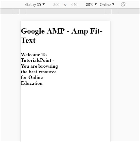
如果您使用 amp-fit-text 查看显示,内容会尝试根据可用空间进行调整。
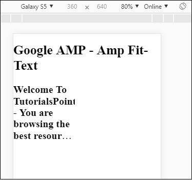
Amp-fit-text 带有两个属性 max-font-size 和 min-font-size。
当我们使用 max-font-size 时,如果空间不足以渲染文本,它将尝试减小大小并调整到可用空间内。
如果我们指定 min-font-size,并且空间不足,它将截断文本并在文本隐藏的地方显示点。
示例
让我们来看一个有效的例子,在这个例子中,我们将为 amp-fit-text 指定 max-font-size 和 min-font-size。
<!doctype html>
<html amp lang = "en">
   <head>
      <meta charset = "utf-8">
      <script async src = "https://cdn.ampproject.org/v0.js"></script>
      <title>Google AMP - Amp Fit-Text</title>
      <link rel = "canonical" href = " http://example.ampproject.org/article-metadata.html">
      <meta name = "viewport" content = "width = device-width,minimum-scale = 1,initial-scale = 1">

      <style amp-boilerplate>
         body{
            -webkit-animation:
            -amp-start 8s steps(1,end) 0s 1 normal both;-moz-animation:
            -amp-start 8s steps(1,end) 0s 1 normal both;-ms-animation:
            -amp-start 8s steps(1,end) 0s 1 normal both;animation:
            -amp-start 8s steps(1,end) 0s 1 normal both
         }
         @-webkit-keyframes
         -amp-start{from{visibility:hidden}to{visibility:visible}}@-moz-keyframes
         -amp-start{from{visibility:hidden}to{visibility:visible}}@-ms-keyframes
         -amp-start{from{visibility:hidden}to{visibility:visible}}@-o-keyframes
         -amp-start{from{visibility:hidden}to{visibility:visible}}@keyframes
         -amp-start{from{visibility:hidden}to{visibility:visible}}
      </style>

      <noscript>
         <style amp-boilerplate>
            body{
               -webkit-animation:none;
               -moz-animation:none;
               -ms-animation:none;
               animation:none}
         </style>
     </noscript>

      <script async custom-element = "amp-fit-text" src =
         "https://cdn.ampproject.org/v0/amp-fit-text-0.1.js">
      </script>
   </head>

   <body>
      <h1>Google AMP - Amp Fit-Text</h1>
      <div style = "width:150px;height:150px; ">
         <amp-fit-text
            width = "150"
            height = "150"
            layout = "responsive"
            max-font-size = "30"
            min-font-size = "25">

            <b>Welcome To TutorialsPoint - You are
            browsing the best resource for Online Education</b>
         </amp-fit-text>
      </div>
   </body>
</html>
输出
广告