- Google AMP 教程
- Google AMP - 首页
- Google AMP - 概览
- Google AMP - 简介
- Google AMP - 图片
- Google AMP - 表单
- Google AMP - 内联框架
- Google AMP - 视频
- Google AMP - 按钮
- Google AMP - Timeago
- Google AMP - MathML
- Google AMP - 自动调整文本大小
- Google AMP - 日期倒计时
- Google AMP - 日期选择器
- Google AMP - 故事
- Google AMP - 选择器
- Google AMP - 链接
- Google AMP - 字体
- Google AMP - 列表
- Google AMP - 用户通知
- Google AMP - 下一页
- Google AMP - 属性
- 样式和自定义 CSS
- Google AMP - 动态 CSS 类
- Google AMP - 动作和事件
- Google AMP - 动画
- Google AMP - 数据绑定
- Google AMP - 布局
- Google AMP - 广告
- Google AMP - 分析
- Google AMP - 社交小工具
- Google AMP - 媒体
- HTML 页面转换为 AMP 页面
- Google AMP - 基本语法
- Google AMP - 验证
- Google AMP - 缓存
- Google AMP - 自定义 JavaScript
- Google AMP - CORS
- Google AMP 有用资源
- Google AMP - 快速指南
- Google AMP - 有用资源
- Google AMP - 讨论
Google AMP - 日期选择器
AMP 日期选择器是一个 AMP 组件,它在页面上显示日历,用户可以在其中选择日期。AMP 日期选择器可以作为静态日历显示,也可以基于输入选择显示,即点击按钮。
要使 amp-date-picker 工作,我们需要将以下脚本添加到页面:
<script async custom-element = "amp-date-picker"
   src = "https://cdn.ampproject.org/v0/amp-date-picker-0.1.js">
</script>
Amp-date-picker 标签
amp-date-picker 标签如下所示:
<amp-date-picker layout = "fixed-height" height = "360"></amp-date-picker>
支持的属性
amp-date-picker 支持以下属性:
| 序号 | 属性 & 描述 |
|---|---|
| 1 | mode 可用的选项包括 static 和 overlay。对于 static,日历将在页面上默认打开。对于 Overlay,日历将在交互后打开。 |
| 2 | mode 可用的选项包括 single 和 range。使用 single,您只能在日历上选择一个日期。使用 range,您可以选择多个日期,但必须在一个连续的范围内。 |
| 3 | input-selector 这可以是日期输入的查询选择器。例如,对于 id 是 #nameoftheid,对于类是 .nameoftheclass。日期将更新为分配了 id 的标签。 |
| 4 | start-input-selector 这可以是日期输入的查询选择器。例如,对于 id 是 #nameoftheid,对于类是 .nameoftheclass。日期将更新为分配了 id 的标签。 |
| 5 | end-input-selector 这可以是日期输入的查询选择器。例如,对于 id 是 #nameoftheid,对于类是 .nameoftheclass。日期将更新为分配了 id 的标签。 |
| 6 | min 用户可以选择的最早日期。这必须格式化为 ISO 8601 日期。如果没有 min 属性,则当前日期将是最小日期。 |
| 7 | max 用户可以选择的最晚日期。这必须格式化为 ISO 8601 日期。如果没有 max 属性,则日期选择器将没有最大日期。 |
| 8 | month-format 您需要显示所选日期的月份格式。默认值为“MMMM YYYY”。 |
| 9 | format 您希望在输入框或使用其选择器的任何 htmlelement 中显示日期的格式。默认为“YYYY-MM-DD”。 |
| 10 | week-day-format 显示星期几的格式。 |
| 11 | locale 显示日历视图的区域设置。默认为 en。 |
| 12 | minimum-nights 用户必须在日期范围内选择的夜晚数。默认为“1”。值为“0”允许用户为开始日期和结束日期选择相同的日期。 |
| 13 | number-of-months 在日历视图中一次显示的月份数。默认为“1”。 |
| 14 | first-day-of-week 指定为一周的第一天的日期 (0-6)。默认值为“0”(星期日)。 |
| 15 | day-size 日历视图表格中日期单元格的大小(以 px 为单位)。默认为 39。 |
主要的属性是type 和 mode。对于mode,我们有static 和overlay 类型的日历。对于type,我们可以有single 和range 选项。使用type = ”single”,我们只能从日历中选择一个日期;对于type = ”range”,我们可以选择多个日期,但必须在一个范围内。
现在,让我们通过一些实际例子来了解静态和叠加类型日历的 amp-date-picker。
AMP 静态日期选择器
对于静态类型日期选择器,我们需要指定 mode=static,如下例所示。
示例
<!doctype html>
<html amp lang = "en">
   <head>
      <meta charset = "utf-8">
      <script async src = "https://cdn.ampproject.org/v0.js"></script>
      <title>Google AMP - Amp Date-Picker Static </title>
      <link rel = "canonical" href = " http://example.ampproject.org/article-metadata.html">
      <meta name = "viewport" content = "width = device-width, minimum-scale = 1,initial-scale = 1">

      <style amp-boilerplate>
         body{
            -webkit-animation:
            -amp-start 8s steps(1,end) 0s 1 normal both;-moz-animation:
            -amp-start 8s steps(1,end) 0s 1 normal both;-ms-animation:
            -amp-start 8s steps(1,end) 0s 1 normal both;animation:
            -amp-start 8s steps(1,end) 0s 1 normal both
         }
         @-webkit-keyframes
         -amp-start{from{visibility:hidden}to{visibility:visible}}@-moz-keyframes
         -amp-start{from{visibility:hidden}to{visibility:visible}}@-ms-keyframes
         -amp-start{from{visibility:hidden}to{visibility:visible}}@-o-keyframes
         -amp-start{from{visibility:hidden}to{visibility:visible}}@keyframes
         -amp-start{from{visibility:hidden}to{visibility:visible}}
      </style>
      <noscript>
         <style amp-boilerplate>
            body{-webkit-animation:
            none;-moz-animation:none;-ms-animation:none;animation:none}
         </style>
      </noscript>

      <script async custom-element = "amp-date-picker"
         src = "https://cdn.ampproject.org/v0/amp-date-picker-0.1.js">
      </script>

      <script async custom-element = "amp-bind"
         src = "https://cdn.ampproject.org/v0/amp-bind-0.1.js">
      </script>
      <script async custom-template = "amp-mustache"
         src = "https://cdn.ampproject.org/v0/amp-mustache-0.1.js">
      </script>

      <style>
         input[type = text]{
            width: 50%;
            padding: 12px;
            border: 1px
            solid #ccc;
            border-radius: 4px;
            resize: vertical;
         }
         label {
            padding: 12px 12px 12px 0;display: inline-block;
         }
         .col-label {
            float: left;width: 25%;margin-top: 6px;
         }
         .col-content {
            float: left;width: 75%;margin-top: 6px;
         }
         .row:after {
            content: "";display: table;clear: both;
         }
         .amp_example {
            background-color: #f1f1f1;
            padding: 0.01em 16px;
            margin: 20px 0;
            box-shadow: 0 2px 4px 0
            rgba(0,0,0,0.16),0 2px 10px 0
            rgba(0,0,0,0.12)!important;
         }
         h3{font-family: "Segoe UI",Arial,sans-serif;
         font-weight: 400;margin: 10px 0;}
      </style>
   </head>
   <body>
      <div class = "amp_example">
         <h3>Google AMP - Amp Date-Picker using type = single</h3>
         <amp-date-picker
            id = "static-date"
            type = "single"
            mode = "static"
            layout = "fixed-height"
            height = "600"
            format = "YYYY-MM-DD"
            input-selector = "#date">

            <div class = "row">
               <div class = "col-label">
                  <label for = "start">
                     Date is:
                  </label>
               </div>
               <div class = "col-content">
                  <input type = "text" id = "date" name = "date"
                     placeholder = "Date Selected Is...">
               </div>
            </div>
         </amp-date-picker>
      <div>
   </body>
</html>
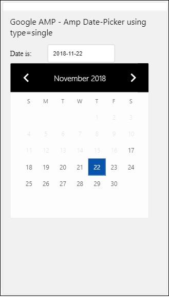
请注意,在这个例子中,我们默认在屏幕上显示日历,也就是日期选择器。
用户选择的日期将显示在文本字段中,如下面的演示屏幕所示:
输出
如何获取从 amp-date-picker 中选择的日期?
如果您查看上面的示例,有一个名为input-selector的属性,它被赋予了文本字段的 id。当用户选择日期时,它将显示在输入字段中。
<amp-date-picker
   id = "static-date"
   type = "single"
   mode = "static"
   layout = "fixed-height"
   height = "600"
   format = "YYYY-MM-DD"
   input-selector = "#date"

   <div class = "row">
      <div class = "col-label">
         <label for = "start">Date is:</label>
      </div>
      <div class = "col-content">
         <input type = "text" id = "date" name = "date"
         placeholder = "Date Selected Is...">
      </div>
   </div>

</amp-date-picker>
您也可以如下所示为 input-selector 属性赋予 name 属性:
<amp-date-picker
   type = "single"
   mode = "static"
   layout = "container"
   input-selector = "[name = date]">
   <input type = "text" id = "date" name = "date" placeholder = "Date Selected Is...">
</amp-date-picker>
如果未给出 input-selector,则 amp-date-picker 将创建一个隐藏的输入字段,并使用 amp-date-picker 的 id 为其命名为date 或 ${id}-date。
我们将讨论更多使用日期选择器中可用不同属性的示例。在上面,我们可以选择单个日期,因为我们提到type=”single”并将 mode 设置为 static。我们也可以通过将 type 设置为type=”range”来选择日期范围。
示例
<!doctype html>
<html amp lang = "en">
   <head>
      <meta charset = "utf-8">
      <script async src = "https://cdn.ampproject.org/v0.js"></script>
      <title>Google AMP - Amp Date-Picker Static </title>
      <link rel = "canonical" href = "http://example.ampproject.org/article-metadata.html">
      <meta name = "viewport" content = "width = device-width, minimum-scale = 1,initial-scale = 1">

      <style amp-boilerplate>
         body{-webkit-animation:
            -amp-start 8s steps(1,end) 0s 1 normal both;-moz-animation:
            -amp-start 8s steps(1,end) 0s 1 normal both;-ms-animation:
            -amp-start 8s steps(1,end) 0s 1 normal both;animation:
            -amp-start 8s steps(1,end) 0s 1 normal both
         }
         @-webkit-keyframes
         -amp-start{from{visibility:hidden}to{visibility:visible}}@-moz-keyframes
         -amp-start{from{visibility:hidden}to{visibility:visible}}@-ms-keyframes
         -amp-start{from{visibility:hidden}to{visibility:visible}}@-o-keyframes
         -amp-start{from{visibility:hidden}to{visibility:visible}}@keyframes
         -amp-start{from{visibility:hidden}to{visibility:visible}}
      </style>
      <noscript>
         <style amp-boilerplate>
            body{
            -webkit-animation:
            none;-moz-animation:none;-ms-animation:none;animation:none}
         </style>
      </noscript>

      <script async custom-element = "amp-date-picker"
         src = "https://cdn.ampproject.org/v0/amp-date-picker-0.1.js">
      </script>

      <script async custom-element = "amp-bind"
         src = "https://cdn.ampproject.org/v0/amp-bind-0.1.js">
      </script>

      <script async custom-template = "amp-mustache"
         src = "https://cdn.ampproject.org/v0/amp-mustache-0.1.js">
      </script>

      <style>
         input[type = text]{
            width: 50%;
            padding: 12px;
            border: 1px solid #ccc;
            border-radius: 4px;
            resize: vertical;
         }
         label {padding: 12px 12px 12px 0;display: inline-block;}
         .col-label {float: left;width: 25%;margin-top: 6px;}
         .col-content {float: left;width: 75%;margin-top: 6px;}
         .row:after {content: "";display: table;clear: both;}
         .amp_example {
            background-color: #f1f1f1;
            padding: 0.01em 16px;
            margin: 20px 0;
            box-shadow: 0 2px 4px 0
            rgba(0,0,0,0.16),0 2px 10px 0
            rgba(0,0,0,0.12)!important;
         }
         h3{
            font-family: "Segoe UI",Arial,sans-serif;
            font-weight: 400;margin: 10px 0;
         }
      </style>
   </head>
   <body>
      <div class = "amp_example">
         <h3>Google AMP - Amp Date-Picker Static Multi Select Dates using type = range</h3>
         <amp-date-picker
            id = "static-date"
            type = "range"
            mode = "static"
            layout = "fixed-height"
            height = "600"
            start-input-selector = "#start"
            end-input-selector = "#end"
            format = "YYYY-MM-DD"
            input-selector = "#static-date-input">

            <div class = "row">
               <div class = "col-label">
                  <label for = "start">Start Date:</label>
               </div>
               <div class = "col-content">
                  <input type = "text" id = "start"
                  name = "start" placeholder = "Start Date">
               </div>
            </div>
            <div class = "row">
               <div class = "col-label">
                  <label for = "end">End Date:</label>
               </div>
               <div class = "col-content">
                  <input type = "text" id = "end"
                  name = "end" placeholder = "End Date">
               </div>
            </div>
         </amp-date-picker>
      </div>
   </body>
</html>
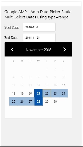
输出
上面代码的输出如下所示:
如何使用 type= ”range” 获取从 amp-date-picker 中选择的开始日期和结束日期?
为了获取开始日期和结束日期,我们使用了 amp-date-picker 属性start-input-selector 和end-input-selector。
语法的详细信息如下所示:
<amp-date-picker
   id = "static-date"
   type = "range"
   mode = "static"
   layout = "fixed-height"
   height = "600"
   start-input-selector = "#start"
   end-input-selector="#end"
   format = "YYYY-MM-DD"
   input-selector = "#static-date-input">

   <input type = "text" id = "start" name = "start" placeholder="Start Date">
   <input type = "text" id = "end" name = "end" placeholder = "End Date">
</amp-date-picker>
这两个选择器都有一个输入字段 id,我们希望在那里显示开始日期和结束日期。您也可以像这里讨论的那样给出输入字段的名称。
AMP 叠加日期选择器
对于叠加模式日期选择器,日历将响应输入字段显示。正如我们对静态日期选择器所做的那样,我们可以使用 type=”single” 和 type=”range” 进行叠加。
现在让我们来看一个为叠加类型日期选择器选择日期范围的实际例子。
示例
<!doctype html>
<html amp lang = "en">
   <head>
      <meta charset = "utf-8">
      <script async src = "https://cdn.ampproject.org/v0.js"></script>
      <itle>Google AMP - Amp Date-Picker Static</title>
      <link rel = "canonical" href = "http://example.ampproject.org/article-metadata.html">
      <meta name = "viewport" content = "width = device-width,minimum-scale = 1,initial-scale = 1">
      <style amp-boilerplate>
         body{
            -webkit-animation:
            -amp-start 8s steps(1,end) 0s 1 normal both;-moz-animation:
            -amp-start 8s steps(1,end) 0s 1 normal both;-ms-animation:
            -amp-start 8s steps(1,end) 0s 1 normal both;animation:
            -amp-start 8s steps(1,end) 0s 1 normal both
         }
         @-webkit-keyframes
         -amp-start{from{visibility:hidden}to{visibility:visible}}@-moz-keyframes
         -amp-start{from{visibility:hidden}to{visibility:visible}}@-ms-keyframes
         -amp-start{from{visibility:hidden}to{visibility:visible}}@-o-keyframes
         -amp-start{from{visibility:hidden}to{visibility:visible}}@keyframes
         -amp-start{from{visibility:hidden}to{visibility:visible}}
      </style>
      <noscript>
         <style amp-boilerplate>
            body{
            -webkit-animation:
            none;-moz-animation:none;-ms-animation:none;animation:none}
         </style>
      </noscript>

      <script async custom-element = "amp-date-picker"
         src = "https://cdn.ampproject.org/v0/amp-date-picker-0.1.js">
      </script>
      <script async custom-element = "amp-bind"
         src = "https://cdn.ampproject.org/v0/amp-bind-0.1.js">
      </script>
      <script async custom-template = "amp-mustache"
         src = "https://cdn.ampproject.org/v0/amp-mustache-0.1.js">
      </script>

      <style>
         input[type=text]{
            width: 50%;
            padding: 12px;border:
            1px solid #ccc;
            border-radius: 4px;resize: vertical;
         }
         label {
            padding: 12px 12px 12px 0;
            display: inline-block;
            font-family: "Segoe UI",Arial,sans-serif;
            font-weight: 400;
         }
         .col-label {float: left;width: 25%;margin-top: 6px;}
         .col-content {float: left;width: 75%;margin-top: 6px;}
         .row:after {content: "";display: table;clear: both;}
         .amp_example {
            background-color: #f1f1f1;
            padding: 0.01em 16px;
            margin: 20px 0;
            box-shadow: 0 2px 4px 0
            rgba(0,0,0,0.16),0 2px 10px 0
            rgba(0,0,0,0.12)!important;
         }
         h3{font-family: "Segoe UI",Arial,sans-serif;font-weight: 400;margin: 10px 0;}
         button { background-color: #ACAD5C;
            color: white;
            padding: 12px 20px;
            border: none;
            border-radius: 4px;
            cursor: pointer;
            float: right;
         }
      </style>
   </head>
   <body>
      <div class = "amp_example">
         <h3>Google AMP - Amp Date-Picker Overlay Multi Select Dates using type = rangelt;/h3>
         <amp-date-picker id = "overlay-date"
            type = "range"
            mode = "overlay"
            start-input-selector = "#start"
            end-input-selector = "#end"
            format = "YYYY-MM-DD"
            open-after-select
            input-selector = "#start">

            <div class = "row">
               <div class = "col-label">
                  <label for = "start">Start Date:lt;/label>
               </div>
               <div class = "col-content">
                  <input type = "text" id = "start"
                     name = "start" placeholder = "Start Date">
               </div>
            </div>
            <div class = "row">
               <div class = "col-label">
                  <label for = "end">End Date:lt;/label>
               </div>
               <div class = "col-content">
                  <input type = "text" id="end" name = "end"
                     placeholder = "End Date">
               </div>
            </div>
            <div class = "row">
               <div class = "col-label">
               </div>
               <div class = "col-content">
                  <button class = "ampstart-btn caps" on = "tap:overlay-date.clear">
                     Clear
                  </button>
               </div>
            </div>
        </amp-date-picker>
     </div>
  </body>
</html>
输出
上面代码的输出如下所示:
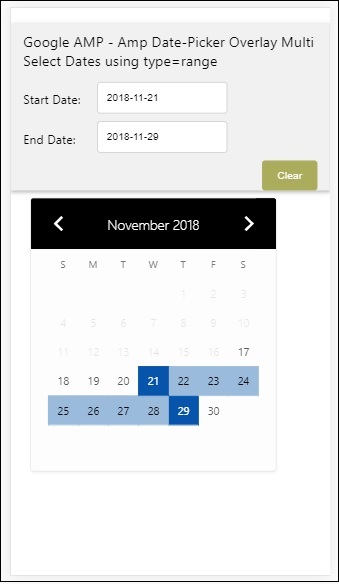
我们已经了解了如何获取开始日期和结束日期。请注意,我们在这里使用了另一个属性open-after-select。此属性将在选择后保持叠加层打开。如果您点击日期选择器外部,它将关闭。还有一个名为 clear 的按钮。点击 clear 按钮,选择的日期将被清除。执行此操作的语法如下:
<button class = "ampstart-btn caps" on = "tap:overlay-date.clear">
   Clear
</button>
要添加事件,我们必须使用on属性。本教程的事件章节将进一步讨论事件的详细信息。我们使用了标签行为,并为其提供了日期选择器的 id 和 clear 事件,该事件负责清除所选的日期范围。
接下来,让我们看看如何将 amp-date-picker 用作灯箱。
AMP 灯箱日期选择器
日期选择器可以在模式窗口内使用。我们也可以对灯箱日期选择器做同样的事情。让我们借助一个实际例子来理解这一点。
要在灯箱内使用日期选择器,我们需要添加灯箱脚本,如下所示:
<script async custom-element = "amp-lightbox"
   src = "https://cdn.ampproject.org/v0/amp-lightbox-0.1.js">
</script>
示例
<!doctype html>
<html amp lang = "en">
   <head>
      <meta charset = "utf-8">
      <script async src = "https://cdn.ampproject.org/v0.js"></script>
      <title>Google AMP - Amp Date-Picker Static </title>
      <link rel = "canonical" href = "http://example.ampproject.org/article-metadata.html">
      <meta name = "viewport" content = "width=device-width,minimum-scale = 1,initial-scale = 1">

      <style amp-boilerplate>
         body{
            -webkit-animation:
            -amp-start 8s steps(1,end) 0s 1 normal both;-moz-animation:
            -amp-start 8s steps(1,end) 0s 1 normal both;-ms-animation:
            -amp-start 8s steps(1,end) 0s 1 normal both;animation:
            -amp-start 8s steps(1,end) 0s 1 normal both
         }
         @-webkit-keyframes
         -amp-start{from{visibility:hidden}to{visibility:visible}}@-moz-keyframes
         -amp-start{from{visibility:hidden}to{visibility:visible}}@-ms-keyframes
         -amp-start{from{visibility:hidden}to{visibility:visible}}@-o-keyframes
         -amp-start{from{visibility:hidden}to{visibility:visible}}@keyframes
         -amp-start{from{visibility:hidden}to{visibility:visible}}
      </style>
      <noscript>
         <style amp-boilerplate>
            body{
               -webkit-animation:none;
               -moz-animation:none;
               -ms-animation:none;
               animation:none}
         </style>
      </noscript>

      <script async custom-element = "amp-date-picker"
         src = "https://cdn.ampproject.org/v0/amp-date-picker-0.1.js">
      </script>

      <script async custom-element = "amp-bind" src = "
      https://cdn.ampproject.org/v0/amp-bind-0.1.js">
      <script>

      <script async custom-template = "amp-mustache"
         src = "https://cdn.ampproject.org/v0/amp-mustache-0.1.js">
      </script>

      <script async custom-element = "amp-lightbox"
         src = "https://cdn.ampproject.org/v0/amp-lightbox-0.1.js">
      </script>

      <style>
         input[type=text]{
            width: 50%;
            padding: 12px;
            border: 1px solid #ccc;
            border-radius: 4px;
            resize: vertical;
         }
         label {
            padding: 12px 12px 12px 0;
            display: inline-block;
            font-family: "Segoe UI",Arial,sans-serif;
            font-weight: 400;
         }
         .col-label {
            float: left;width: 25%;
            margin-top: 6px;
         }
         .col-content {
            float: left;
            width: 75%;
            margin-top: 6px;
         }
         .row:after {
            content: "";
            display: table;clear: both;
         }
         .amp_example {
            background-color: #f1f1f1;
            padding: 0.01em 16px;
            margin: 20px 0;
            box-shadow: 0 2px 4px 0 rgba(0,0,0,0.16),0 2px 10px 0rgba(0,0,0,0.12)!important;
         }
         h3{font-family: "Segoe UI",Arial,sans-serif;
            font-weight: 400;
            margin: 10px 0;
         }
         button {
            background-color: #ACAD5C;
            color: white;
            padding: 12px 20px;
            border: none;
            border-radius: 4px;
            cursor: pointer;
            float: right;
         }
         .lightbox {background-color: rgba(100, 100, 100, 0.5);}
      </style>
   </head>
   <body>
      <div class = "amp_example">
         <h3>Google AMP - Amp Date-Picker Overlay Multi Select Dates using type = range</h3>
         <div class = "row">
            <div class = "col-label">
               <label for = "start">Start Date:</label>
            <div>
            <div class = "col-content">
               <input type = "text" id = "start" name =
               "start" placeholder = "Start Date" on = "tap:lightbox.open">
            </div>
         </div>
         <div class = "row">
            <div class = "col-label">
               <label for = "end">End Date:</label>
            </div>
            <div class = "col-content">
               <input type = "text" id = "end" name =
                  "end" placeholder = "End Date" on = "tap:lightbox.open">
            </div>
         </div>
         <div class = "row">
            <div class = "col-label"></div>
            <div class = "col-content">
            <button class = "ampstart-btn caps" on =
               "tap:overlay-date.clear">Clear</button>
            </div>
         </div>
         <amp-lightbox id = "lightbox" layout = "nodisplay" class = "lightbox">
            <amp-date-picker id = "overlay-date"
               type = "range"
               layout = "fill"
               start-input-selector = "#start"
               end-input-selector = "#end"
               format = "YYYY-MM-DD"
               on = "activate: lightbox.open;deactivate: lightbox.close">
            </amp-date-picker>
         </amp-lightbox>
      </div>
   </body>
</html>
输出
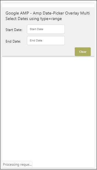
当用户点击输入字段时,日期选择器将在灯箱内打开,如下所示:

要执行此操作,需要在输入字段上添加一个事件,如下所示:
<input type = "text" id = "start" name = "start"
   placeholder = "Start Date" on = "tap:lightbox.open">

<input type = "text" id = "end" name = "end"
   placeholder = "End Date" on = "tap:lightbox.open">
请注意,“on”是它调用的事件,tap − lightbox.open 用于打开灯箱。
这里 lightbox 是赋予 amp-lightbox 的 id,如下所示。Amp-date-picker 在 amp-lightbox 内调用,并在点击输入字段时激活。
<amp-lightbox id = "lightbox" layout = "nodisplay" class = "lightbox">
   <amp-date-picker id = "overlay-date"
      type = "range"
      layout = "fill"
      start-input-selector = "#start"
      end-input-selector = "#end"
      format = "YYYY-MM-DD"
      on = "activate: lightbox.open;deactivate: lightbox.close">
   </amp-date-picker>
</amp-lightbox>