- CSS 教程
- CSS - 首页
- CSS - 路线图
- CSS - 简介
- CSS - 语法
- CSS - 选择器
- CSS - 导入
- CSS - 测量单位
- CSS - 颜色
- CSS - 背景
- CSS - 字体
- CSS - 文本
- CSS - 图片
- CSS - 链接
- CSS - 表格
- CSS - 边框
- CSS - 块级边框
- CSS - 内联边框
- CSS - 外边距
- CSS - 列表
- CSS - 内边距
- CSS - 光标
- CSS - 轮廓
- CSS - 尺寸
- CSS - 滚动条
- CSS - 内联块
- CSS - 下拉菜单
- CSS - 可见性
- CSS - 溢出
- CSS - 清除浮动
- CSS - 浮动
- CSS - 箭头
- CSS - 调整大小
- CSS - 引号
- CSS - 顺序
- CSS - 定位
- CSS - 连字符
- CSS - 悬停
- CSS - 显示
- CSS - 聚焦
- CSS - 缩放
- CSS - 平移
- CSS - 高度
- CSS - 连字符字符
- CSS - 宽度
- CSS - 不透明度
- CSS - Z 索引
- CSS - 底部
- CSS - 导航栏
- CSS - 覆盖层
- CSS - 表单
- CSS - 对齐
- CSS - 图标
- CSS - 图片库
- CSS - 注释
- CSS - 加载器
- CSS - 属性选择器
- CSS - 组合器
- CSS - 根元素
- CSS - 盒模型
- CSS - 计数器
- CSS - 剪辑
- CSS - 书写模式
- CSS - Unicode 双向算法
- CSS - min-content
- CSS - 全部
- CSS - 内嵌
- CSS - 隔离
- CSS - 滚动溢出
- CSS - Justify Items
- CSS - Justify Self
- CSS - 制表符大小
- CSS - 指针事件
- CSS - Place Content
- CSS - Place Items
- CSS - Place Self
- CSS - 最大块尺寸
- CSS - 最小块尺寸
- CSS - 混合模式
- CSS - 最大内联尺寸
- CSS - 最小内联尺寸
- CSS - 偏移量
- CSS - 口音颜色
- CSS - 用户选择
- CSS 高级
- CSS - 网格布局
- CSS - 网格布局
- CSS - Flexbox
- CSS - 可见性
- CSS - 定位
- CSS - 图层
- CSS - 伪类
- CSS - 伪元素
- CSS - @规则
- CSS - 文本效果
- CSS - 分页媒体
- CSS - 打印
- CSS - 布局
- CSS - 验证
- CSS - 图片精灵
- CSS - Important
- CSS - 数据类型
- CSS3 教程
- CSS3 - 教程
- CSS - 圆角
- CSS - 边框图片
- CSS - 多背景
- CSS - 颜色
- CSS - 渐变
- CSS - 盒阴影
- CSS - 盒装饰中断
- CSS - 光标颜色
- CSS - 文本阴影
- CSS - 文本
- CSS - 2D 变换
- CSS - 3D 变换
- CSS - 过渡
- CSS - 动画
- CSS - 多列
- CSS - 盒尺寸
- CSS - 工具提示
- CSS - 按钮
- CSS - 分页
- CSS - 变量
- CSS - 媒体查询
- CSS - 函数
- CSS - 数学函数
- CSS - 遮罩
- CSS - 形状
- CSS - 样式图片
- CSS - 特异性
- CSS - 自定义属性
- CSS 响应式
- CSS RWD - 简介
- CSS RWD - 视口
- CSS RWD - 网格视图
- CSS RWD - 媒体查询
- CSS RWD - 图片
- CSS RWD - 视频
- CSS RWD - 框架
- CSS 工具
- CSS - PX 到 EM 转换器
- CSS - 颜色选择器和动画
- CSS 资源
- CSS - 有用资源
- CSS - 讨论
CSS - 缓动函数
CSS 缓动函数用于控制元素两个状态之间过渡或动画的速度。它定义了属性随时间变化的速率,影响动画期间的加速和减速。
以下是一些值得注意的要点
两个值之间的过渡可以应用于各种上下文,包括动画,以控制值变化的速率。
这允许在整个持续时间内动态调整动画速度。
CSS <transitions> 和 <animations> 属性可以使用缓动函数进行自定义以指定此行为。
缓动函数类型
CSS 中可以使用三种主要的缓动函数类型,如下所示
线性函数 (linear),
三次贝塞尔曲线函数 (包括 ease、ease-in、ease-out 和 ease-in-out),
阶梯函数 (steps)。
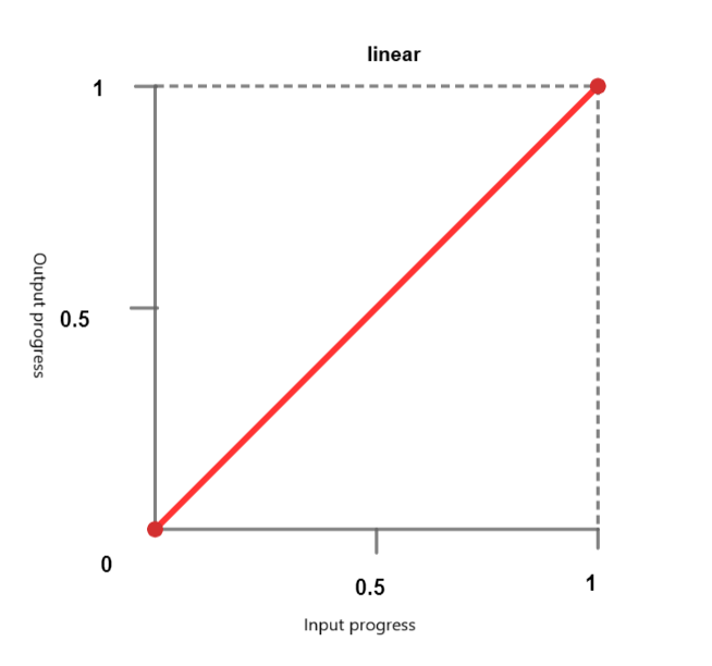
线性函数
使用线性计时函数,动画以恒定速度遍历关键帧。可以传递以下关键字
linear - 动画以恒定速度进行。
linear-easing-function - 这描述了 linear() 函数,该函数用于管理动画或过渡的进度。它使用一个停止列表 linear-stop-list,其中每个点都指定为 0 到 1 之间的一个数字。这可以具有 <number> 或 <percentage> 值。
三次贝塞尔曲线函数
CSS 中的此功能定义了 贝塞尔曲线,这些曲线会影响动画或过渡的进度,并具有四个控制点:起点、终点和两个控制点。
它有助于创建自定义缓动效果。三次贝塞尔曲线函数由四个控制点定义,它允许精确控制动画的加速和减速。预定义的关键字值包括
ease - 此术语表示逐渐的初始插值,然后是快速的加速和逐渐的减速到结束。此术语对应于缓动函数 cubic-bezier(0.25, 0.1, 0.25, 1.0)。
ease-in - 此术语表示插值从缓慢开始,然后变得越来越快,直到突然在结束时停止。此关键字对应于缓动函数 cubic-bezier(0.42, 0.0, 1.0, 1.0)。
ease-out - 此术语表示插值突然开始,然后逐渐减速到结束。此关键字对应于缓动函数 cubic-bezier(0.0, 0.0, 0.58, 1.0)。
ease-in-out - 此关键字表示一个插值,它从缓慢开始,加速,然后在结束时减速。它使用缓动函数 cubic-bezier(0.42, 0.0, 0.58, 1.0),并且在开始时表现得类似于 ease-in,在结束时表现得类似于 ease-out。

<cubic-bezier()> - 此函数使用四个 <number> 值来定义曲线的形状。cubic-bezier(x1, y1, x2, y2)
X 坐标 (x1 和 x2) 表示时间比率,并限制在 0 到 1 之间的值(动画不能早于或持续时间长于指定时间),而 Y 坐标 (y1 和 y2) 表示动画输出及其值。
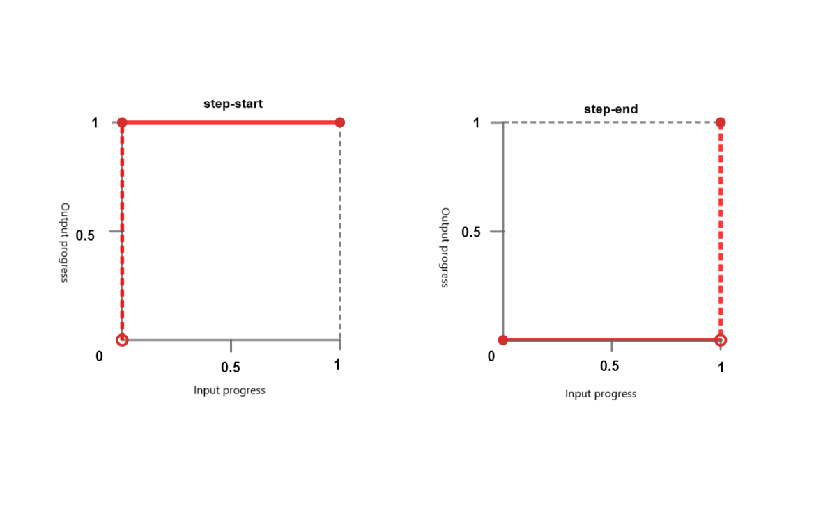
阶梯函数
阶梯函数使动画能够以非连续的方式跳跃到特定数量的帧之间。您可以将其视为“滴答”动画。它接受以下关键字
step-start - 此关键字表示缓动函数 steps(1, jump-start) 或 steps(1, start)。它表示突然跳到插值的最终状态,并在完成之前保持此状态。
step-end - 此关键字表示缓动函数 steps(1, jump-end) 或 steps(1, end)。这意味着插值会保持其初始状态直到结束,然后快速更改为最终状态。
steps() - 此函数采用一个正 <integer> 和一个可选的 <step-position>。
<integer> - 表示均匀间隔或步骤的数量。它应该是一个大于 0 的正整数,除非第二个参数是 jump-none,在这种情况下,它必须是一个大于 1 的正整数。
<step-position> - 指定跳跃发生的时间 - 在开始时、在结束时、在开始和结束时或两者都不在。可用的关键字值包括
jump-start - 这意味着初始跳跃发生在开始时,基本上在点 0 处,在 0% 标记处没有花费时间。
jump-end - 这意味着最后一个跳跃发生在结束时,基本上在点 1 处,在 100% 标记处没有花费时间。如果没有指定 <step-postion>,则这是默认值。
jump-none - 这消除了开始和结束时的跳跃,并在持续时间中省略了一步。进度在 0% 和 100% 标记处保持稳定,持续时间由总持续时间除以步骤数 (1/n) 确定。
jump-both- 这涉及在开始和结束时都进行跳跃,发生在 0 和 1 点。这有效地在两端都添加了一步,在 0% 和 100% 标记处没有花费时间。
start - 是 jump-start 的等效术语。
end- 是 jump-end 的等效术语
语法
/* linear function and keyword */
/* linear(<point-list>) */
linear(1, -0.5, 0)
linear

/* cubic-bezier function and keywords */
/* cubic-bezier(<x1>, <y1>, <x2>, <y2>) */
cubic-bezier(0.25, 0.1, 0.25, 1)
ease
ease-in
ease-out
ease-in-out

/* steps function and keywords */
/* steps(<number-of-steps>, <direction>) */
steps(4, end)
steps(10, jump-both)
step-start
step-end
CSS 缓动函数 - linear-easing
以下示例创建了一个使用 linear-easing 函数水平移动的红色框。动画持续 4 秒,并无限重复,导致框连续来回移动。
<html>
<head>
<style>
   .box {
      width: 100px;
      height: 100px;
      margin: 150px;
      background-color: red;
      text-align:center;
      font-size:20px;
      position: relative;
      display: flex;
  	   justify-content: center;
  	   align-items: center;
      animation: move 4s linear infinite;
   }
   @keyframes move {
      0% {
         left: 5%;
      }
      100% {
         left: 60%;
      }
   }
</style>
</head>
<body>
   <div class="box">Linear Easing Function</div>
</body>
</html>
CSS 缓动函数 - 带值的 linear-easing
以下示例演示了接受值的各种 linear-easing 函数。
动画从位置 0 开始,并直接向前移动到 0.25。之后,它继续直线前进,直到到达 1。动画在其运行时间内的进度由符号 linear(0, 0.25 75%, 1) 表示。
<html>
<head>
<style>
   .box {
      width: 100px;
      height: 100px;
      margin: 150px;
      background-color: red;
      text-align:center;
      display: flex;
      justify-content: center;
      align-items: center;
      font-size:20px;
      position: relative;
      animation: move 4s linear infinite;
   }
   .linear-demo-1 {
      animation-name: linear-custom;
      animation-timing-function: linear(0, 0.25 75%, 1);
   }
    @keyframes linear-custom {
      from {transform: translateX(0);}
      to {transform: translateX(350px);}
   }
</style>
</head>
<body>
<div class="box linear-demo-1">Linear Custom</div>
</body>
</html>
CSS 缓动函数 - cubic-bezier
以下示例演示了各种 cubic-bezier 函数。
ease-in 框从缓慢开始并加速,ease-out 框从快速开始并减速,ease-in-out 框从缓慢开始,在中间加速,然后在动画结束时减速。
<html>
<head>
<style>
   .box {
      width: 100px;
      height: 100px;
      background-color: #0077FF;
      margin: 20px auto;
      animation-duration: 4s;
      animation-iteration-count: infinite;
      text-align: center;
      font-size: 20px;
      display: flex;
      justify-content: center;
      align-items: center;
   }
   .ease-in-demo {
      animation-name: easeIn;
      animation-timing-function: ease-in;
   }
   .ease-out-demo {
      animation-name: easeOut;
      animation-timing-function: ease-out;
   }
   .ease-in-out-demo {
      animation-name: easeInOut;
      animation-timing-function: ease-in-out;
   }
   @keyframes easeIn {
      from {transform: translateX(0);}
      to {transform: translateX(400px);}
   }
   @keyframes easeOut {
      from {transform: translateX(0);}
      to {transform: translateX(400px);}
   }
   @keyframes easeInOut {
      from {transform: translateX(0);}
      to {transform: translateX(400px);}
   }
</style>
</head>
<body>
   <div class="box ease-in-demo">Ease-in</div>
   <div class="box ease-out-demo">Ease-out</div>
   <div class="box ease-in-out-demo">Ease-in-out</div>
</body>
</html>
CSS 缓动函数 - 带值的 cubic-bezier。
以下示例演示了带值的各种 cubic-bezier 函数。
通过此配置,会产生动画效果,其中每个框在使用不同的 cubic-bezier 计时函数从其初始位置向右移动 300 像素时具有不同的运动行为。
<html>
<head>
<style>
   .box {
      width: 120px;
      height: 110px;
      background-color: #e3bd56;
      margin: 20px auto;
      animation-duration: 4s;
      animation-iteration-count: infinite;
      text-align: center;
      font-size: 20px;
      left:10px;
      display: flex;
      justify-content: center;
      align-items: center;
   }
   .cubic-bezier-demo-1 {
      animation-name: cubicBezier1;
      animation-timing-function: cubic-bezier(0.25, 0.1, 0.25, 1);
   }
   .cubic-bezier-demo-2 {
      animation-name: cubicBezier2;
      animation-timing-function: cubic-bezier(0.42, 0, 0.58, 1);
   }
   .cubic-bezier-demo-3 {
      animation-name: cubicBezier3;
      animation-timing-function: cubic-bezier(0.55, 0.055, 0.675, 0.19);
   }
   .cubic-bezier-demo-4 {
      animation-name: cubicBezier4;
      animation-timing-function: cubic-bezier(0.95, 0.05, 0.795, 0.035);
   }
   @keyframes cubicBezier1 {
      from {transform: translateX(0);}
      to {transform: translateX(300px);}
   }
   @keyframes cubicBezier2 {
      from {transform: translateX(0);}
      to {transform: translateX(300px);}
   }
   @keyframes cubicBezier3 {
      from {transform: translateX(0);}
      to {transform: translateX(300px);}
   }
   @keyframes cubicBezier4 {
      from {transform: translateX(0);}
      to {transform: translateX(300px);}
   }
</style>
</head>
<body>
   <div class="box cubic-bezier-demo-1">Cubic Bezier (0.25, 0.1, 0.25, 1)</div>
   <div class="box cubic-bezier-demo-2">Cubic Bezier (0.42, 0, 0.58, 1)</div>
   <div class="box cubic-bezier-demo-3">Cubic Bezier (0.55, 0.055, 0.675, 0.19)</div>
   <div class="box cubic-bezier-demo-4">Cubic Bezier (0.95, 0.05, 0.795, 0.035)</div>
</body>
</html>
CSS 缓动函数 - step-easing
以下示例演示了各种 step-easing 函数。
<html>
<head>
<style>
   body {
      display: flex;
      justify-content: space-around;
      align-items: center;
      height: 100vh;
      margin: 0;
      display: flex;
      justify-content: center;
      align-items: center;
   }
   .box {
      width: 100px;
      height: 50px;
      background-color: red;
      display: flex;
      justify-content: center;
      align-items: center;
      text-align: center;
      font-size: 16px;
      margin: 10px;
      animation: move 6s infinite;
   }
   .jump-start {
      animation-timing-function:steps(6, jump-start);
   }
   .jump-end {
      animation-timing-function:steps(6, jump-end);
   }
   .jump-both {
      animation-timing-function:steps(6, jump-both);
   }
   .jump-none {
      animation-timing-function:steps(6, jump-none);
   }
   .step-start {
      animation-timing-function: step-start;
   }
   .step-end {
      animation-timing-function: step-end;
   }
   .start {
      animation-timing-function: steps(6, start);
   }
   .end {
   animation-timing-function: steps(6, end);
   }
   @keyframes move {
      0%, 100% {
      transform: translateY(0);
      }
      50% {
      transform: translateY(250px);
      }
   }
</style>
</head>
<body>
<div class="box jump-start">Jump-start</div>
<div class="box jump-end">Jump-end</div>
<div class="box jump-both">Jump-both</div>
<div class="box jump-none">Jump-none</div>
<div class="box step-start">Step-start</div>
<div class="box step-end">Step-end</div>
<div class="box start">Start</div>
<div class="box end">End</div>
</body>
</html>