- CSS 教程
- CSS - 首页
- CSS - 路线图
- CSS - 简介
- CSS - 语法
- CSS - 选择器
- CSS - 包含
- CSS - 测量单位
- CSS - 颜色
- CSS - 背景
- CSS - 字体
- CSS - 文本
- CSS - 图片
- CSS - 链接
- CSS - 表格
- CSS - 边框
- CSS - 块级边框
- CSS - 内联边框
- CSS - 外边距
- CSS - 列表
- CSS - 内边距
- CSS - 光标
- CSS - 轮廓
- CSS - 尺寸
- CSS - 滚动条
- CSS - 块内联
- CSS - 下拉菜单
- CSS - 可见性
- CSS - 溢出
- CSS - 清除浮动
- CSS - 浮动
- CSS - 箭头
- CSS - 调整大小
- CSS - 引号
- CSS - 顺序
- CSS - 位置
- CSS - 连字符
- CSS - 悬停
- CSS - 显示
- CSS - 焦点
- CSS - 缩放
- CSS - 位移
- CSS - 高度
- CSS - 连字符字符
- CSS - 宽度
- CSS - 不透明度
- CSS - Z-Index
- CSS - 底部
- CSS - 导航栏
- CSS - 叠加层
- CSS - 表单
- CSS - 对齐
- CSS - 图标
- CSS - 图片库
- CSS - 注释
- CSS - 加载器
- CSS - 属性选择器
- CSS - 组合器
- CSS - 根元素
- CSS - 盒模型
- CSS - 计数器
- CSS - 剪裁
- CSS - 书写模式
- CSS - Unicode-bidi
- CSS - min-content
- CSS - 全部
- CSS - 内嵌
- CSS - 隔离
- CSS - 溢出滚动
- CSS - Justify Items
- CSS - Justify Self
- CSS - 制表符大小
- CSS - 指针事件
- CSS - Place Content
- CSS - Place Items
- CSS - Place Self
- CSS - 最大块级大小
- CSS - 最小块级大小
- CSS - 混合模式
- CSS - 最大内联大小
- CSS - 最小内联大小
- CSS - 偏移
- CSS - 强调色
- CSS - 用户选择
- CSS 高级
- CSS - 网格
- CSS - 网格布局
- CSS - Flexbox
- CSS - 可见性
- CSS - 定位
- CSS - 图层
- CSS - 伪类
- CSS - 伪元素
- CSS - @规则
- CSS - 文本效果
- CSS - 分页媒体
- CSS - 打印
- CSS - 布局
- CSS - 验证
- CSS - 图片精灵
- CSS - !important
- CSS - 数据类型
- CSS3 教程
- CSS3 - 教程
- CSS - 圆角
- CSS - 边框图片
- CSS - 多重背景
- CSS - 颜色
- CSS - 渐变
- CSS - 盒阴影
- CSS - 盒装饰中断
- CSS - 光标颜色
- CSS - 文本阴影
- CSS - 文本
- CSS - 二维变换
- CSS - 三维变换
- CSS - 过渡
- CSS - 动画
- CSS - 多列
- CSS - 盒尺寸
- CSS - 工具提示
- CSS - 按钮
- CSS - 分页
- CSS - 变量
- CSS - 媒体查询
- CSS - 函数
- CSS - 数学函数
- CSS - 遮罩
- CSS - 形状
- CSS - 样式图片
- CSS - 特异性
- CSS - 自定义属性
- CSS 响应式
- CSS RWD - 简介
- CSS RWD - 视口
- CSS RWD - 网格视图
- CSS RWD - 媒体查询
- CSS RWD - 图片
- CSS RWD - 视频
- CSS RWD - 框架
- CSS 工具
- CSS - PX 到 EM 转换器
- CSS - 颜色选择器和动画
- CSS 资源
- CSS - 有用资源
- CSS - 讨论
CSS - 圆角
CSS 圆角是使用border-radius属性创建的。此属性允许您指定元素外边界边缘角的半径。
可能的值
<length>:使用长度值表示圆半径的大小。负值无效。
<percentage>:使用百分比值表示圆半径的大小。
水平轴百分比指的是盒子的宽度。
垂直轴百分比指的是盒子的高度。
负值无效。
应用于
所有 HTML 元素,除了border-collapse设置为 collapse 的表格和inline-table元素。应用于::first-letter。
DOM 语法
object.style.borderRadius = "length";
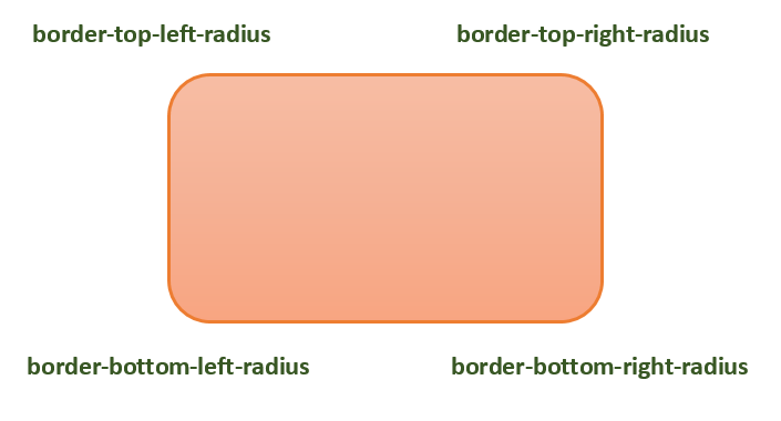
下图演示了不同的 border-radius 角作为参考
下表显示了圆角的可能值如下:
| 值 | 描述 | |
|---|---|---|
| radius |  |
是 <length> 或 <percentage>,用于设置元素所有四个角的半径。它仅用于单值语法。 |
| 左上角和右下角 |  |
是 <length> 或 <percentage>,用于设置元素左上角和右下角的半径。它仅用于双值语法。 |
| 右上角和左下角 |  |
是 <length> 或 <percentage>,用于设置元素右上角和左下角的半径。它仅用于双值和三值语法。 |
| 左上角 |  |
是 <length> 或 <percentage>,用于设置元素左上角的半径。它用于三值和四值语法。 |
| 右上角 |  |
是 <length> 或 <percentage>,用于设置元素右上角的半径。它仅用于四值语法。 |
| 右下角 |  |
是 <length> 或 <percentage>,用于设置元素右下角的半径。它仅用于三值和四值语法。 |
| 左下角 |  |
是 <length> 或 <percentage>,用于设置元素左下角的半径。它仅用于四值语法。 |
诸如border-top-left-radius之类的单个边框半径属性不能从其父元素继承。相反,必须使用单个详细属性来设置每个角的边框半径。
CSS 边框半径 - 长度值
以下示例演示如何使用border-radius属性为盒子的所有四个角创建圆角:
<html>
<head>
<style>
   .rounded-box {
      width: 200px;
      height: 100px;
      background-color: pink;
      line-height: 100px;
      border-radius: 20px;
   }
</style>
</head>
<body>
   <div class="rounded-box">
      This is a rounded corner box.
   </div>
</body>
</html>
您可以使用border-radius属性为盒子、边框和图像创建圆角。
这是一个例子:
<html>
<head>
<style>
   .rounded-box {
      width: 200px;
      height: 100px;
      background-color: pink;
      border-radius: 20px;
      margin-bottom: 10px;
   }
   .border-box {
      width: 200px;
      height: 100px;
      border-radius: 2em;
      border: 3px solid green;
      margin-bottom: 20px;
   }
   .img-border-radius {
      background-image: url(images/tree.jpg);
      background-size: 100% 100%;
      border-radius: 20%;
      width: 200px;
      height: 150px;
   }
</style>
</head>
<body>
   <div class="rounded-box">
      This is a rounded corner box.
   </div>
   <div class="border-box">
      This is a rounded corner box.
   </div>
   <div class="img-border-radius">
      This is a rounded corner image.
   </div>
</body>
</html>
您可以使用border-radius属性在元素上创建不同的圆角样式。
这是一个例子:
<html>
<head>
<style>
   .rounded-box {
      width: 200px;
      height: 100px;
      background-color: pink;
      margin: 10px;
      padding: 5px;
   }
   .rounded-box.tl {
      border-radius: 30px 0 0 0;
   }
   .rounded-bo x.tr {
      border-radius: 0 2em 0 0;
   }
   .rounded-box.bl {
      border-radius: 0 0 0 15%;
   }
   .rounded-box.br {
      border-radius: 0 0 30px 0;
   }
   .rounded-box.tl-br {
      border-radius:  2em 0 2em 0;
   }
   .rounded-box.tr-bl {
      border-radius: 0 15% 0 15%;
   }
</style>
</head>
<body>
   <div class="rounded-box tl">
      top-left rounded corner.
   </div>
   <div class="rounded-box tr">
      top-right rounded corner.
   </div>
   <div class="rounded-box bl">
      bottom-left rounded corner.
   </div>
   <div class="rounded-box br">
      bottom-right rounded corner.
   </div>
   <div class="rounded-box tl-br">
      top-left and bottom-right rounded corners.
   </div>
   <div class="rounded-box tr-bl">
      top-right and bottom-left rounded corners.
   </div>
</body>
</html>
CSS 圆角图像
您可以使用border-radius属性在元素上创建不同的圆角样式。
这是一个例子:
<html>
<head>
<style>
   img {
      width: 200px;
      height: 100px;
      margin: 10px;
   }
   .top-left {
      border-radius: 30px 0 0 0;
   }
   .top-right {
      border-radius: 0 2em 0 0;
   }
   .bottom-left {
      border-radius: 0 0 0 15%;
   }
   .bottom-right {
      border-radius: 0 0 30px 0;
   }
   .tl-br {
      border-radius:  2em 0 2em 0;
   }
   .tr-bl {
      border-radius: 0 15% 0 15%;
   }
</style>
</head>
<body>
   <h4>top-left rounded corner.</h4>
   <img class="top-left" src="images/tree.jpg" />
   <h4>top-right rounded corner.</h4>
   <img class="top-right" src="images/tree.jpg" />
   <h4> bottom-left rounded corner.</h4>
   <img class="bottom-left" src="images/tree.jpg" />
   <h4>bottom-right rounded corner.</h4>
   <img class="bottom-right" src="images/tree.jpg" />
   <h4>top-left and bottom-right rounded corners.</h4>
   <img class="tl-br" src="images/tree.jpg" />
   <h4>top-right and bottom-left rounded corners.</h4>
   <img class="tr-bl" src="images/tree.jpg" />
</body>
</html>
我们可以使用 CSS border-radius属性创建圆形和椭圆形。
这是一个例子:
<html>
<head>
<style>
   .rounded-circle {
      width: 100px;
      height: 100px;
      background-color: pink;
      text-align: center;
      border-radius: 50%;
   }
   .rounded-ellipse {
      width: 200px;
      height: 100px;
      background-color: pink;
      text-align: center;
      border-radius: 50%;
   }
</style>
</head>
<body>
   <div class="rounded-circle">
      circle
   </div>
   <div class="rounded-ellipse">
      ellipse
   </div>
</body>
</html>
CSS border-radius - 相关属性
以下是与border-radius相关的 CSS 属性列表
| 属性 | 值 |
|---|---|
| border-top-left-radius | 设置元素边框左上角的圆度。 |
| border-top-right-radius | 设置元素边框右上角的圆度。 |
| border-bottom-right-radius | 设置元素边框右下角的圆度。 |
| border-bottom-left-radius | 设置元素边框左下角的圆度。 |
| border-start-start-radius | 设置元素边框块起始和内联起始角的圆度。 |
| border-start-end-radius | 设置元素边框块起始和内联结束角的圆度。 |
| border-end-start-radius | 设置元素边框块结束和内联起始角的圆度。 |
| border-end-end-radius | 设置元素边框块结束和内联结束角的圆度。 |
广告