- Matplotlib 基础
- Matplotlib - 首页
- Matplotlib - 简介
- Matplotlib - 与 Seaborn 的对比
- Matplotlib - 环境设置
- Matplotlib - Anaconda 发行版
- Matplotlib - Jupyter Notebook
- Matplotlib - Pyplot API
- Matplotlib - 简单绘图
- Matplotlib - 保存图形
- Matplotlib - 标记
- Matplotlib - 图形
- Matplotlib - 样式
- Matplotlib - 图例
- Matplotlib - 颜色
- Matplotlib - 颜色映射
- Matplotlib - 颜色映射归一化
- Matplotlib - 选择颜色映射
- Matplotlib - 色标
- Matplotlib - 文本
- Matplotlib - 文本属性
- Matplotlib - 子图标题
- Matplotlib - 图像
- Matplotlib - 图像蒙版
- Matplotlib - 注释
- Matplotlib - 箭头
- Matplotlib - 字体
- Matplotlib - 什么是字体?
- 全局设置字体属性
- Matplotlib - 字体索引
- Matplotlib - 字体属性
- Matplotlib - 刻度
- Matplotlib - 线性与对数刻度
- Matplotlib - 对称对数和 Logit 刻度
- Matplotlib - LaTeX
- Matplotlib - 什么是 LaTeX?
- Matplotlib - LaTeX 用于数学表达式
- Matplotlib - 在注释中使用 LaTeX 文本格式
- Matplotlib - PostScript
- 在注释中启用 LaTeX 渲染
- Matplotlib - 数学表达式
- Matplotlib - 动画
- Matplotlib - 图形对象
- Matplotlib - 使用 Cycler 进行样式设置
- Matplotlib - 路径
- Matplotlib - 路径效果
- Matplotlib - 变换
- Matplotlib - 刻度和刻度标签
- Matplotlib - 弧度刻度
- Matplotlib - 日期刻度
- Matplotlib - 刻度格式化器
- Matplotlib - 刻度定位器
- Matplotlib - 基本单位
- Matplotlib - 自动缩放
- Matplotlib - 反转轴
- Matplotlib - 对数轴
- Matplotlib - Symlog
- Matplotlib - 单位处理
- Matplotlib - 带单位的椭圆
- Matplotlib - 脊柱
- Matplotlib - 轴范围
- Matplotlib - 轴刻度
- Matplotlib - 轴刻度
- Matplotlib - 格式化轴
- Matplotlib - Axes 类
- Matplotlib - 双轴
- Matplotlib - Figure 类
- Matplotlib - 多图
- Matplotlib - 网格
- Matplotlib - 面向对象接口
- Matplotlib - PyLab 模块
- Matplotlib - Subplots() 函数
- Matplotlib - Subplot2grid() 函数
- Matplotlib - 固定图形对象
- Matplotlib - 手动等值线
- Matplotlib - 坐标报告
- Matplotlib - AGG 滤波器
- Matplotlib - 带状框
- Matplotlib - 填充螺旋
- Matplotlib - Findobj 演示
- Matplotlib - 超链接
- Matplotlib - 图像缩略图
- Matplotlib - 使用关键字绘图
- Matplotlib - 创建 Logo
- Matplotlib - 多页 PDF
- Matplotlib - 多进程
- Matplotlib - 打印标准输出
- Matplotlib - 复合路径
- Matplotlib - Sankey 类
- Matplotlib - MRI 与 EEG
- Matplotlib - 样式表
- Matplotlib - 背景颜色
- Matplotlib - Basemap
- Matplotlib 事件处理
- Matplotlib - 事件处理
- Matplotlib - 关闭事件
- Matplotlib - 鼠标移动
- Matplotlib - 点击事件
- Matplotlib - 滚动事件
- Matplotlib - 按键事件
- Matplotlib - 选择事件
- Matplotlib - 观察镜
- Matplotlib - 路径编辑器
- Matplotlib - 多边形编辑器
- Matplotlib - 定时器
- Matplotlib - Viewlims
- Matplotlib - 缩放窗口
- Matplotlib 小部件
- Matplotlib - 光标小部件
- Matplotlib - 带注释的光标
- Matplotlib - 按钮小部件
- Matplotlib - 复选框
- Matplotlib - 套索选择器
- Matplotlib - 菜单小部件
- Matplotlib - 鼠标光标
- Matplotlib - 多光标
- Matplotlib - 多边形选择器
- Matplotlib - 单选按钮
- Matplotlib - 范围滑块
- Matplotlib - 矩形选择器
- Matplotlib - 椭圆选择器
- Matplotlib - 滑块小部件
- Matplotlib - 跨度选择器
- Matplotlib - 文本框
- Matplotlib 绘图
- Matplotlib - 条形图
- Matplotlib - 直方图
- Matplotlib - 饼图
- Matplotlib - 散点图
- Matplotlib - 箱线图
- Matplotlib - 小提琴图
- Matplotlib - 等值线图
- Matplotlib - 3D 绘图
- Matplotlib - 3D 等值线
- Matplotlib - 3D 线框图
- Matplotlib - 3D 表面图
- Matplotlib - Quiver 图
- Matplotlib 有用资源
- Matplotlib - 快速指南
- Matplotlib - 有用资源
- Matplotlib - 讨论
Matplotlib - 3D 绘图
3D 绘图是一种以图形格式表示三维数据的方式。它允许您在三个空间维度(表示为 X、Y 和 Z 坐标)中可视化信息。在 3D 图中,数据点不仅位于平面中,而且具有深度,从而创建数据集更详细的表示。

Matplotlib 中的 3D 绘图
在 Matplotlib 中,我们可以使用 **mpl_toolkits.mplot3d** 模块创建三维图。此模块提供用于创建三维可视化的工具,包括散点图、线图、表面图等。这些图提供了一种在三维空间中表示和探索数据点或数学函数的方式。您可以自定义颜色、标记、标签和透视等方面,以更有效地传达信息。
我们可以将 **numpy** 库与 **mpl_toolkits.mplot3d** 模块集成,以生成多维数据和不同的函数,例如 scatter、plot_surface 或 plot_wireframe。
mpl_toolkits.mplot3d 模块
Matplotlib 中的“mpl_toolkits.mplot3d”模块增强了库的三维绘图功能。它引入了“Axes3D”类,该类能够创建 3D 子图。此模块通过 scatter()(用于 3D 散点图)、plot_surface()(用于表面图)和 plot_wireframe()(用于线框表示)等函数,促进了三维数据可视化。
3D 散点图
Matplotlib 中的 3D 散点图是一种可视化,其中数据点在三维空间中表示为单个标记。每个数据点由三个值定义,分别对应于其沿 X、Y 和 Z 轴的位置。这些轴创建了一个三维网格,每个标记都放置在该空间中的指定坐标处。我们可以使用 scatter() 函数创建此类型的图。
示例
在以下示例中,我们使用 NumPy 生成随机 3D 数据点,并使用蓝色标记创建 3D 散点图。我们在三维空间中显示图,其中 x、y 和 z 轴表示点的坐标 -
import matplotlib.pyplot as plt
from mpl_toolkits.mplot3d import Axes3D
import numpy as np

# Generating random 3D data
np.random.seed(42)
n_points = 100
x = np.random.rand(n_points)
y = np.random.rand(n_points)
z = np.random.rand(n_points)

# Creating a 3D scatter plot
fig = plt.figure()
ax = fig.add_subplot(111, projection='3d')
ax.scatter(x, y, z, c='blue', marker='o')

ax.set_xlabel('X Axis')
ax.set_ylabel('Y Axis')
ax.set_zlabel('Z Axis')
ax.set_title('3D Scatter Plot')
plt.show()
输出
生成的图显示了曲线下逐渐的颜色过渡 -

3D 线图
Matplotlib 中的 3D 线图是一种图形表示,显示三维空间中一系列点之间的连接。与传统 2D 线图(其中点在平面上连接)不同,3D 线图扩展到三个维度,在 X、Y 和 Z 轴上形成一条连续的线。
我们可以使用 plot() 函数在 matplotlib 中创建 3D 线图。当我们将此函数与 projection='3d' 设置一起使用时,它能够生成 3D 线图。
示例
在这里,我们通过基于参数方程定义坐标(x、y 和 z)来生成 3D 线图的数据。生成的图在三维空间中显示螺旋形。x、y 和 z 轴分别表示坐标 -
import matplotlib.pyplot as plt
from mpl_toolkits.mplot3d import Axes3D
import numpy as np

# Generating data for a 3D line plot
theta = np.linspace(-4 * np.pi, 4 * np.pi, 100)
z = np.linspace(-2, 2, 100)
r = z**2 + 1
x = r * np.sin(theta)
y = r * np.cos(theta)

# Creating a 3D line plot
fig = plt.figure()
ax = fig.add_subplot(111, projection='3d')
ax.plot(x, y, z, label='3D Line Plot')

ax.set_xlabel('X Axis')
ax.set_ylabel('Y Axis')
ax.set_zlabel('Z Axis')
ax.set_title('3D Line Plot')
plt.show()
输出
执行上述代码后,我们将获得以下输出 -

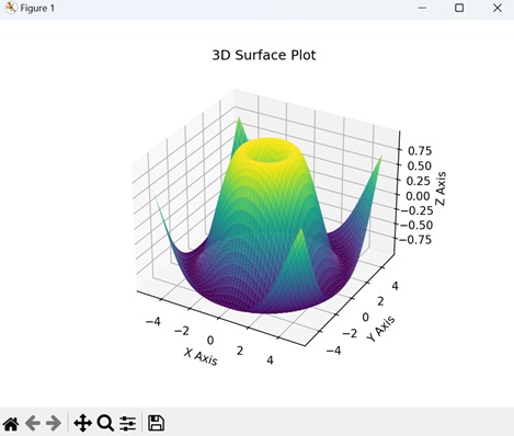
3D 表面图
Matplotlib 中的 3D 表面图是三维空间中数学函数或数据集的视觉表示。此图不使用平面线或标记,而是使用连续的表面来显示变量如何在两个输入维度(X 和 Y)上变化,并取决于第三个维度(Z)。我们可以使用 plot_surface() 函数创建此类型的图。
示例
在这里,我们通过计算网格上每个点到原点的欧几里德距离的正弦来生成 3D 表面图的数据。生成的图可视化了一个基于正弦函数上升和下降的表面。x、y 和 z 轴分别表示坐标和表面的高度 -
import matplotlib.pyplot as plt
from mpl_toolkits.mplot3d import Axes3D
import numpy as np

# Generating data for a 3D surface plot
x = np.linspace(-5, 5, 100)
y = np.linspace(-5, 5, 100)
x, y = np.meshgrid(x, y)
z = np.sin(np.sqrt(x**2 + y**2))

# Creating a 3D surface plot
fig = plt.figure()
ax = fig.add_subplot(111, projection='3d')
ax.plot_surface(x, y, z, cmap='viridis')

ax.set_xlabel('X Axis')
ax.set_ylabel('Y Axis')
ax.set_zlabel('Z Axis')
ax.set_title('3D Surface Plot')
plt.show()
输出
执行上述代码后,我们将获得以下输出 -
3D 条形图
Matplotlib 中的 3D 条形图是一种视觉表示,其中数据在三维空间中使用矩形条表示。与常规条形图(其中条形沿两个轴(X 和 Y)放置)类似,3D 条形图添加了第三个维度(Z)来表示每个条形的高度或幅度。我们可以使用 bar3d() 函数创建此类型的图。
示例
在下面的示例中,我们生成一个 3D 条形图的数据,该图在“x”和“y”方向上都有五个条形。每个条形的高度由“z”数组中的值确定。生成的图可视化了一组具有不同高度的三维条形,x、y 和 z 轴分别表示图的维度 -
import matplotlib.pyplot as plt
from mpl_toolkits.mplot3d import Axes3D
import numpy as np

# Generating data for a 3D bar plot
x_pos = np.arange(1, 6)
y_pos = np.arange(1, 6)
x_pos, y_pos = np.meshgrid(x_pos, y_pos)
z_pos = np.zeros_like(x_pos)
z = np.array([[5, 8, 3, 6, 2],
   [1, 2, 3, 4, 5],
   [2, 3, 6, 7, 8],
   [5, 6, 7, 8, 9],
   [3, 4, 5, 7, 8]])

# Creating a 3D bar plot
fig = plt.figure()
ax = fig.add_subplot(111, projection='3d')
ax.bar3d(x_pos.flatten(), y_pos.flatten(), z_pos.flatten(), 0.8, 0.8, z.flatten(), shade=True)

ax.set_xlabel('X Axis')
ax.set_ylabel('Y Axis')
ax.set_zlabel('Z Axis')
ax.set_title('3D Bar Plot')
plt.show()
输出
执行上述代码后,我们将获得以下输出 -
