- Matplotlib 基础
- Matplotlib - 首页
- Matplotlib - 简介
- Matplotlib - 与 Seaborn 的比较
- Matplotlib - 环境设置
- Matplotlib - Anaconda 发行版
- Matplotlib - Jupyter Notebook
- Matplotlib - Pyplot API
- Matplotlib - 简单绘图
- Matplotlib - 保存图表
- Matplotlib - 标记
- Matplotlib - 图表
- Matplotlib - 风格
- Matplotlib - 图例
- Matplotlib - 颜色
- Matplotlib - 颜色图
- Matplotlib - 颜色图归一化
- Matplotlib - 选择颜色图
- Matplotlib - 颜色条
- Matplotlib - 文本
- Matplotlib - 文本属性
- Matplotlib - 子图标题
- Matplotlib - 图片
- Matplotlib - 图片蒙版
- Matplotlib - 注释
- Matplotlib - 箭头
- Matplotlib - 字体
- Matplotlib - 什么是字体?
- 全局设置字体属性
- Matplotlib - 字体索引
- Matplotlib - 字体属性
- Matplotlib - 刻度
- Matplotlib - 线性刻度和对数刻度
- Matplotlib - 对称对数刻度和Logit刻度
- Matplotlib - LaTeX
- Matplotlib - 什么是LaTeX?
- Matplotlib - LaTeX用于数学表达式
- Matplotlib - 在注释中使用LaTeX文本格式
- Matplotlib - PostScript
- 启用注释中的LaTeX渲染
- Matplotlib - 数学表达式
- Matplotlib - 动画
- Matplotlib - 图形对象
- Matplotlib - 使用Cycler进行样式设置
- Matplotlib - 路径
- Matplotlib - 路径效果
- Matplotlib - 变换
- Matplotlib - 刻度和刻度标签
- Matplotlib - 弧度刻度
- Matplotlib - 日期刻度
- Matplotlib - 刻度格式化器
- Matplotlib - 刻度定位器
- Matplotlib - 基本单位
- Matplotlib - 自动缩放
- Matplotlib - 反转坐标轴
- Matplotlib - 对数坐标轴
- Matplotlib - Symlog
- Matplotlib - 单位处理
- Matplotlib - 带单位的椭圆
- Matplotlib - 脊柱
- Matplotlib - 坐标轴范围
- Matplotlib - 坐标轴刻度
- Matplotlib - 坐标轴刻度
- Matplotlib - 格式化坐标轴
- Matplotlib - Axes 类
- Matplotlib - 双坐标轴
- Matplotlib - Figure 类
- Matplotlib - 多图
- Matplotlib - 网格
- Matplotlib - 面向对象接口
- Matplotlib - PyLab 模块
- Matplotlib - subplots() 函数
- Matplotlib - subplot2grid() 函数
- Matplotlib - 锚定图形对象
- Matplotlib - 手动等值线
- Matplotlib - 坐标报告
- Matplotlib - AGG 滤镜
- Matplotlib - 带状框
- Matplotlib - 填充螺旋线
- Matplotlib - findobj 演示
- Matplotlib - 超链接
- Matplotlib - 图片缩略图
- Matplotlib - 使用关键字绘图
- Matplotlib - 创建Logo
- Matplotlib - 多页PDF
- Matplotlib - 多进程
- Matplotlib - 打印标准输出
- Matplotlib - 复合路径
- Matplotlib - Sankey 类
- Matplotlib - MRI 与 EEG
- Matplotlib - 样式表
- Matplotlib - 背景颜色
- Matplotlib - Basemap
- Matplotlib 事件处理
- Matplotlib - 事件处理
- Matplotlib - 关闭事件
- Matplotlib - 鼠标移动
- Matplotlib - 点击事件
- Matplotlib - 滚动事件
- Matplotlib - 按键事件
- Matplotlib - 选择事件
- Matplotlib - 透镜
- Matplotlib - 路径编辑器
- Matplotlib - 多边形编辑器
- Matplotlib - 定时器
- Matplotlib - Viewlims
- Matplotlib - 缩放窗口
- Matplotlib 小部件
- Matplotlib - 光标小部件
- Matplotlib - 带注释的光标
- Matplotlib - 按钮小部件
- Matplotlib - 复选框
- Matplotlib - 套索选择器
- Matplotlib - 菜单小部件
- Matplotlib - 鼠标光标
- Matplotlib - 多光标
- Matplotlib - 多边形选择器
- Matplotlib - 单选按钮
- Matplotlib - RangeSlider
- Matplotlib - 矩形选择器
- Matplotlib - 椭圆选择器
- Matplotlib - 滑块小部件
- Matplotlib - Span Selector
- Matplotlib - 文本框
- Matplotlib 绘图
- Matplotlib - 条形图
- Matplotlib - 直方图
- Matplotlib - 饼图
- Matplotlib - 散点图
- Matplotlib - 箱线图
- Matplotlib - 小提琴图
- Matplotlib - 等值线图
- Matplotlib - 3D 绘图
- Matplotlib - 3D 等值线
- Matplotlib - 3D 线框图
- Matplotlib - 3D 表面图
- Matplotlib - Quiver 图
- Matplotlib 有用资源
- Matplotlib - 快速指南
- Matplotlib - 有用资源
- Matplotlib - 讨论
Matplotlib - 手动等值线
手动等值线通常指手工勾勒物体或特定区域边界,而不是依赖自动化方法的过程。这通常是为了创建图像中形状和边界的精确表示。
等值线在图或地图上表示恒定值。它就像在地形图上连接具有相同高度的点,或在天气图上连接具有相同温度的地点。

Matplotlib 中的手动等值线
在 Matplotlib 中,手动等值线图是一种使用等值线将三维数据表示在二维表面上的方法。这些线连接数据集里值相等点,创建连续数据的类似地图的可视化。
对于手动等值线图,您需要指定绘制线条的等值线级别或值。然后,该图将显示这些等值线,每条线代表数据集中特定的值。
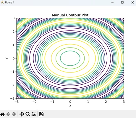
基本的 手动等值线图
在 Matplotlib 中创建基本的 手动等值线图包括绘制线以连接具有相同值的点,形成代表被测量的量的不同级别的闭合环路或曲线。此过程允许自定义和微调等值线以准确地表示给定数据。
虽然手动等值线绘制可能非常耗时,但在某些情况下,自动化方法可能不足的情况下,它可以提供必要的控制和精度。
示例
在下面的例子中,我们使用 Matplotlib 创建一个简单的等值线图。我们使用 `contour()` 函数生成正弦函数的等值线,并手动指定级别,将它们叠加在 XY 平面上 -
import matplotlib.pyplot as plt
import numpy as np

# Generating data
x = np.linspace(-3, 3, 100)
y = np.linspace(-3, 3, 100)
# Creating a grid of x and y values
X, Y = np.meshgrid(x, y)
# Calculating the value of Z using the given function
Z = np.sin(X**2 + Y**2)

# Creating contour plot with manual levels
levels = [-0.9, -0.6, -0.3, 0, 0.3, 0.6, 0.9]
plt.contour(X, Y, Z, levels=levels)
plt.xlabel('X')
plt.ylabel('Y')
plt.title('Manual Contour Plot')
# Displaying the plot
plt.show()
输出
以下是上述代码的输出 -
带有标签的手动等值线图
在 Matplotlib 中,带有标签的手动等值线图用等值线表示二维表面上的三维数据,并用标签标注特定的等值线级别。
这种类型的图显示等值线以显示数据值相等的区域,并向这些线添加文本标签以指示相应的数据值。标签有助于识别数据集中重要的特征或值,从而更容易解释该图并理解数据的分布。
示例
在这里,我们使用 `clabel()` 函数创建具有内联标签的等值线图 -
import matplotlib.pyplot as plt
import numpy as np

# Generating data
x = np.linspace(-3, 3, 100)
y = np.linspace(-3, 3, 100)
X, Y = np.meshgrid(x, y)
Z = np.sin(X**2 + Y**2)

# Contour plot with labels
levels = [-0.9, -0.6, -0.3, 0, 0.3, 0.6, 0.9]
CS = plt.contour(X, Y, Z, levels=levels)
plt.clabel(CS, inline=True, fontsize=12)
plt.xlabel('X')
plt.ylabel('Y')
plt.title('Manual Contour Plot with Labeling')
plt.show()
输出
执行上述代码后,我们将获得以下输出 -

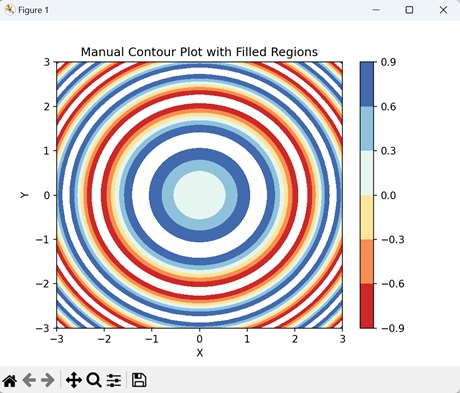
带有填充区域的手动等值线图
在 Matplotlib 中,带有填充区域的手动等值线图使用颜色来直观地表示数据集中不同的级别或值,这与仅显示等值线的传统等值线图不同。
每个填充区域对应于特定范围的值,颜色表示这些值的强度或大小。
示例
在下面的示例中,我们使用 `contourf()` 函数和 "RdYlBu" 颜色图创建正弦函数的填充等值线图。然后,我们添加一个颜色条来指示填充等值线的强度比例 -
import matplotlib.pyplot as plt
import numpy as np

# Generating data
x = np.linspace(-3, 3, 100)
y = np.linspace(-3, 3, 100)
X, Y = np.meshgrid(x, y)
Z = np.sin(X**2 + Y**2)

# Creating contour plot with filled regions
plt.contourf(X, Y, Z, levels=[-0.9, -0.6, -0.3, 0, 0.3, 0.6, 0.9], cmap='RdYlBu')
plt.colorbar()
plt.xlabel('X')
plt.ylabel('Y')
plt.title('Manual Contour Plot with Filled Regions')
plt.show()
输出
执行上述代码后,我们将获得以下输出 -
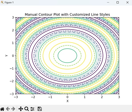
带有自定义线型的手动等值线图
在 Matplotlib 中,带有自定义线型的手动等值线图是一种表示等值线的方法,其中每条线都可以具有独特的视觉样式。
通常,等值线绘制为实线,但是使用自定义线型,您可以修改线宽、颜色和图案等方面,以区分数据集中不同的级别或值。例如,您可以使用虚线、点线或粗线来突出显示特定的等值线级别或感兴趣的区域。
示例
现在,我们通过指定用于不同级别的线型列表来创建具有自定义线型的手动等值线图。我们通过将 "linestyles" 参数传递给 `contour()` 函数来实现此目的 -
import matplotlib.pyplot as plt
import numpy as np

# Generating data
x = np.linspace(-3, 3, 100)
y = np.linspace(-3, 3, 100)
X, Y = np.meshgrid(x, y)
Z = np.sin(X**2 + Y**2)

# Contour plot with custom line styles
levels = [-0.9, -0.6, -0.3, 0, 0.3, 0.6, 0.9]
plt.contour(X, Y, Z, levels=levels, linestyles=['-', '--', '-.', ':', '-', '--'])
plt.xlabel('X')
plt.ylabel('Y')
plt.title('Manual Contour Plot with Customized Line Styles')
plt.show()
输出
执行上述代码后,我们将获得以下输出 -