- Matplotlib 基础
- Matplotlib - 首页
- Matplotlib - 简介
- Matplotlib - 与 Seaborn 的比较
- Matplotlib - 环境设置
- Matplotlib - Anaconda 发行版
- Matplotlib - Jupyter Notebook
- Matplotlib - Pyplot API
- Matplotlib - 简单绘图
- Matplotlib - 保存图片
- Matplotlib - 标记
- Matplotlib - 图形
- Matplotlib - 样式
- Matplotlib - 图例
- Matplotlib - 颜色
- Matplotlib - 颜色映射
- Matplotlib - 颜色映射归一化
- Matplotlib - 选择颜色映射
- Matplotlib - 颜色条
- Matplotlib - 文本
- Matplotlib - 文本属性
- Matplotlib - 子图标题
- Matplotlib - 图片
- Matplotlib - 图片蒙版
- Matplotlib - 注释
- Matplotlib - 箭头
- Matplotlib - 字体
- Matplotlib - 什么是字体?
- 全局设置字体属性
- Matplotlib - 字体索引
- Matplotlib - 字体属性
- Matplotlib - 比例尺
- Matplotlib - 线性比例尺和对数比例尺
- Matplotlib - 对称对数比例尺和 Logit 比例尺
- Matplotlib - LaTeX
- Matplotlib - 什么是 LaTeX?
- Matplotlib - LaTeX 用于数学表达式
- Matplotlib - 在注释中使用 LaTeX 文本格式
- Matplotlib - PostScript
- 在注释中启用 LaTeX 渲染
- Matplotlib - 数学表达式
- Matplotlib - 动画
- Matplotlib - 绘图元素
- Matplotlib - 使用 Cycler 进行样式设置
- Matplotlib - 路径
- Matplotlib - 路径效果
- Matplotlib - 变换
- Matplotlib - 刻度和刻度标签
- Matplotlib - 弧度刻度
- Matplotlib - 日期刻度
- Matplotlib - 刻度格式化器
- Matplotlib - 刻度定位器
- Matplotlib - 基本单位
- Matplotlib - 自动缩放
- Matplotlib - 反转坐标轴
- Matplotlib - 对数坐标轴
- Matplotlib - Symlog
- Matplotlib - 单位处理
- Matplotlib - 带单位的椭圆
- Matplotlib - 脊柱
- Matplotlib - 坐标轴范围
- Matplotlib - 坐标轴比例尺
- Matplotlib - 坐标轴刻度
- Matplotlib - 坐标轴格式化
- Matplotlib - Axes 类
- Matplotlib - 双坐标轴
- Matplotlib - Figure 类
- Matplotlib - 多图
- Matplotlib - 网格
- Matplotlib - 面向对象接口
- Matplotlib - PyLab 模块
- Matplotlib - Subplots() 函数
- Matplotlib - Subplot2grid() 函数
- Matplotlib - 定位绘图元素
- Matplotlib - 手动等高线
- Matplotlib - 坐标报告
- Matplotlib - AGG 滤镜
- Matplotlib - 飘带框
- Matplotlib - 填充螺旋线
- Matplotlib - Findobj 演示
- Matplotlib - 超链接
- Matplotlib - 图片缩略图
- Matplotlib - 使用关键字绘图
- Matplotlib - 创建 Logo
- Matplotlib - 多页 PDF
- Matplotlib - 多进程
- Matplotlib - 打印标准输出
- Matplotlib - 复合路径
- Matplotlib - Sankey 类
- Matplotlib - MRI 与 EEG
- Matplotlib - 样式表
- Matplotlib - 背景颜色
- Matplotlib - Basemap
- Matplotlib 事件处理
- Matplotlib - 事件处理
- Matplotlib - 关闭事件
- Matplotlib - 鼠标移动
- Matplotlib - 点击事件
- Matplotlib - 滚动事件
- Matplotlib - 按键事件
- Matplotlib - 选择事件
- Matplotlib - 观察镜
- Matplotlib - 路径编辑器
- Matplotlib - 多边形编辑器
- Matplotlib - 定时器
- Matplotlib - Viewlims
- Matplotlib - 缩放窗口
- Matplotlib 小部件
- Matplotlib - 光标小部件
- Matplotlib - 带注释的光标
- Matplotlib - 按钮小部件
- Matplotlib - 复选框
- Matplotlib - 套索选择器
- Matplotlib - 菜单小部件
- Matplotlib - 鼠标光标
- Matplotlib - 多光标
- Matplotlib - 多边形选择器
- Matplotlib - 单选按钮
- Matplotlib - RangeSlider
- Matplotlib - 矩形选择器
- Matplotlib - 椭圆选择器
- Matplotlib - 滑块小部件
- Matplotlib - Span 选择器
- Matplotlib - 文本框
- Matplotlib 绘图
- Matplotlib - 条形图
- Matplotlib - 直方图
- Matplotlib - 饼图
- Matplotlib - 散点图
- Matplotlib - 箱线图
- Matplotlib - 小提琴图
- Matplotlib - 等高线图
- Matplotlib - 3D 绘图
- Matplotlib - 3D 等高线
- Matplotlib - 3D 线框图
- Matplotlib - 3D 表面图
- Matplotlib - Quiver 图
- Matplotlib 有用资源
- Matplotlib - 快速指南
- Matplotlib - 有用资源
- Matplotlib - 讨论
Matplotlib - 网格
在一般的数据可视化和绘图中,网格指的是绘图区域上的一组水平和垂直线。网格线有助于更好地理解图表上的数据。通常,这些线与 x 轴和 y 轴上的主要刻度线对齐。它们可以增强图表的可读性,并更容易估计值。
请参见下面的参考图片:
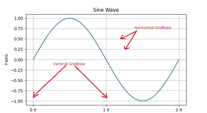
主要有两种类型的网格线:
主要网格线 - 这些是与坐标轴上的主要刻度线对齐的主要网格线。
次要网格线 - 这些是主要网格线之间的附加网格线,与坐标轴上的次要刻度线对齐。
Matplotlib 中网格的介绍
在 Matplotlib 中启用网格线是一个简单的过程。pyplot.grid() 方法向绘图添加主要网格线,并提供额外的自定义选项,包括调整线型、线宽、颜色和透明度。
让我们探索向绘图添加网格线的不同方法。
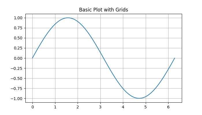
带有网格线的基本绘图
在 Matplotlib 中,默认网格是一组与 x 轴和 y 轴上的主要刻度线对齐的主要网格线。
示例
在这个示例中,我们创建一个基本的正弦波图并添加默认网格。
import matplotlib.pyplot as plt
import numpy as np

# Create some data
x = np.linspace(0, 2 * np.pi, 100)
y = np.sin(x)

# create a plot
fig, ax = plt.subplots(figsize=(7,4))

# Plot the data
plt.plot(x, y)

# Add grid
ax.grid(True)

# set the title
ax.set_title('Basic Plot with Grids')

# Show the plot
plt.show()
输出
执行上述代码后,我们将得到以下输出:
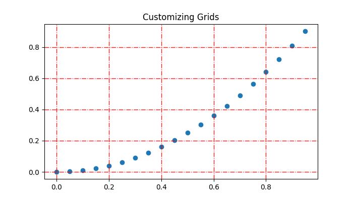
自定义网格
自定义网格线包括线型、线宽、颜色和透明度。
示例
此示例演示如何通过更改网格线的线型、线宽、颜色和透明度来自定义网格线。
import matplotlib.pyplot as plt
import numpy as np

# Create some data
x = np.arange(0, 1, 0.05)
y = x**2

# Create the plot
fig, ax = plt.subplots(figsize=(7,4))

# Plot the data
plt.scatter(x, y)

# Customize grid
ax.grid(True, linestyle='-.', linewidth=1, color='red', alpha=0.9)

# set the title
ax.set_title('Customizing Grids')

# Show the plot
plt.show()
输出
执行上述代码后,我们将得到以下输出:
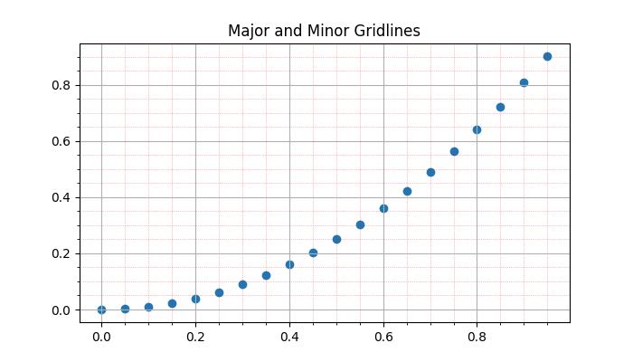
添加次要网格线
除了主要网格线外,Matplotlib 还支持包含次要网格线。这些线位于主要网格线之间,并与 x 轴和 y 轴上的次要刻度线对齐。您可以使用pyplot.minorticks_on() 和 plt.grid(which='minor') 来添加与次要刻度线对应的网格线。示例
此示例演示如何向绘图添加主要和次要网格线。
import matplotlib.pyplot as plt
import numpy as np

# Create some data
x = np.arange(0, 1, 0.05)
y = x**2

# Create the plot
fig, ax = plt.subplots(figsize=(7,4))

# Plot the data
plt.scatter(x, y)

# Add major grid
ax.grid(True)

# Add minor grid
ax.minorticks_on()
ax.grid(which='minor', linestyle=':', linewidth=0.5, color='red', alpha=0.5)

# set the title
ax.set_title('Major and Minor Gridlines')

# Show the plot
plt.show()
输出
执行上述代码后,我们将得到以下输出:
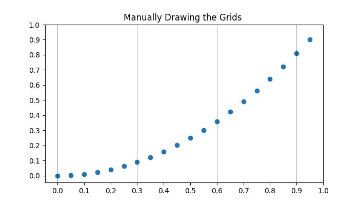
手动添加网格
此方法涉及显式指定垂直线和水平线的位置。通过迭代特定的区间或值,用户可以在所需位置绘制网格线。这涉及使用诸如pyplot.axvline() 和 pyplot.axhline() 等函数分别绘制垂直线和水平线。
示例
这是一个手动在 x 轴上每三个点绘制垂直网格线的示例。
import matplotlib.pyplot as plt
import numpy as np

# Create some data
x = np.arange(0, 1, 0.05)
y = x**2

# Create the plot
plt.subplots(figsize=(7,4))

# Plot the data
plt.scatter(x, y)

# Set x and y tick locations
plt.xticks(np.arange(0, 1.01, 0.1))
plt.yticks(np.arange(0, 1.01, 0.1))
plt.title('Manually Drawing the Grids ')

# Draw grid lines for every third point on the x-axis
for pt in np.arange(0, 1.01, 0.3):
   plt.axvline(pt, lw=0.5, color='black', alpha=0.5)

# Show the plot
plt.show()
输出
执行上述代码后,我们将得到以下输出:
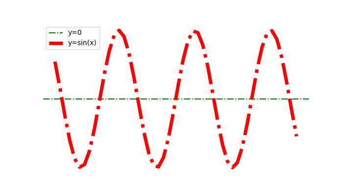
隐藏网格线
可以通过为grid() 函数指定布尔值False 来隐藏或删除绘图中的网格线。
示例
这是一个隐藏绘图的网格线和坐标轴(X 轴和 Y 轴)的示例。
import numpy as np
import matplotlib.pyplot as plt

#  Create a figure
fig = plt.figure(figsize=(7, 4))

# Generate data
x = np.linspace(-10, 10, 50)
y = np.sin(x)

# Plot horizontal line
plt.axhline(y=0, c="green", linestyle="dashdot", label="y=0")

# Plot sine curve
plt.plot(x, y, c="red", lw=5, linestyle="dashdot", label="y=sin(x)")

# Hide gridlines
plt.grid(False)

# Hide axes
plt.axis('off')

# Add legend
plt.legend()

# Show plot
plt.show()
输出
执行上述代码后,您将得到以下输出:
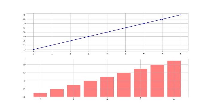
跨越子图的网格线
在比较多个子图中的数据时,在所有子图中使用网格线有助于保持绘图之间的视觉比较。
示例
此示例演示如何在子图中绘制网格线。
import matplotlib.pyplot as plt

# Data
d = [1, 2, 3, 4, 5, 6, 7, 8, 9]
f = [0, 1, 0, 0, 1, 0, 1, 1, 0]

# Create figure and subplots
fig = plt.figure(figsize=(7,4))
fig.set_size_inches(30, 10)
ax1 = fig.add_subplot(211)
ax2 = fig.add_subplot(212)

# Plot data on subplots
ax1.plot(d, marker='.', color='b', label="1 row")

# Draw grid lines behind bar graph
ax2.bar(range(len(d)), d, color='red', alpha=0.5)

# Enable grids on both subplots
ax1.grid()
ax2.grid()

# Display the plot
plt.show()
输出
执行上述代码后,您将得到以下输出: