- Matplotlib 基础
- Matplotlib - 首页
- Matplotlib - 简介
- Matplotlib - 与 Seaborn 的比较
- Matplotlib - 环境配置
- Matplotlib - Anaconda 发行版
- Matplotlib - Jupyter Notebook
- Matplotlib - Pyplot API
- Matplotlib - 简单绘图
- Matplotlib - 保存图形
- Matplotlib - 标记
- Matplotlib - 图形
- Matplotlib - 样式
- Matplotlib - 图例
- Matplotlib - 颜色
- Matplotlib - 颜色图
- Matplotlib - 颜色图归一化
- Matplotlib - 选择颜色图
- Matplotlib - 颜色条
- Matplotlib - 文本
- Matplotlib - 文本属性
- Matplotlib - 子图标题
- Matplotlib - 图片
- Matplotlib - 图片蒙版
- Matplotlib - 注释
- Matplotlib - 箭头
- Matplotlib - 字体
- Matplotlib - 什么是字体?
- 全局设置字体属性
- Matplotlib - 字体索引
- Matplotlib - 字体属性
- Matplotlib - 刻度
- Matplotlib - 线性刻度和对数刻度
- Matplotlib - 对称对数刻度和logit刻度
- Matplotlib - LaTeX
- Matplotlib - 什么是LaTeX?
- Matplotlib - LaTeX用于数学表达式
- Matplotlib - 在注释中使用LaTeX文本格式
- Matplotlib - PostScript
- 启用注释中的LaTeX渲染
- Matplotlib - 数学表达式
- Matplotlib - 动画
- Matplotlib - 图形元素
- Matplotlib - 使用Cycler进行样式设置
- Matplotlib - 路径
- Matplotlib - 路径效果
- Matplotlib - 坐标变换
- Matplotlib - 刻度和刻度标签
- Matplotlib - 弧度刻度
- Matplotlib - 日期刻度
- Matplotlib - 刻度格式化器
- Matplotlib - 刻度定位器
- Matplotlib - 基本单位
- Matplotlib - 自动缩放
- Matplotlib - 反转坐标轴
- Matplotlib - 对数坐标轴
- Matplotlib - Symlog
- Matplotlib - 单位处理
- Matplotlib - 带单位的椭圆
- Matplotlib - 脊柱
- Matplotlib - 坐标轴范围
- Matplotlib - 坐标轴刻度
- Matplotlib - 坐标轴刻度
- Matplotlib - 格式化坐标轴
- Matplotlib - Axes 类
- Matplotlib - 双坐标轴
- Matplotlib - Figure 类
- Matplotlib - 多图
- Matplotlib - 网格
- Matplotlib - 面向对象接口
- Matplotlib - PyLab 模块
- Matplotlib - subplots() 函数
- Matplotlib - subplot2grid() 函数
- Matplotlib - 定位图形元素
- Matplotlib - 手动等高线
- Matplotlib - 坐标报告
- Matplotlib - AGG 滤镜
- Matplotlib - 带状框
- Matplotlib - 填充螺旋线
- Matplotlib - findobj 演示
- Matplotlib - 超链接
- Matplotlib - 图片缩略图
- Matplotlib - 使用关键字进行绘图
- Matplotlib - 创建Logo
- Matplotlib - 多页PDF
- Matplotlib - 多进程
- Matplotlib - 打印标准输出
- Matplotlib - 复合路径
- Matplotlib - Sankey 类
- Matplotlib - MRI 与 EEG
- Matplotlib - 样式表
- Matplotlib - 背景颜色
- Matplotlib - Basemap
- Matplotlib 事件处理
- Matplotlib - 事件处理
- Matplotlib - 关闭事件
- Matplotlib - 鼠标移动
- Matplotlib - 点击事件
- Matplotlib - 滚动事件
- Matplotlib - 按键事件
- Matplotlib - 选择事件
- Matplotlib - 透镜
- Matplotlib - 路径编辑器
- Matplotlib - 多边形编辑器
- Matplotlib - 定时器
- Matplotlib - 视窗限
- Matplotlib - 缩放窗口
- Matplotlib 小部件
- Matplotlib - 光标小部件
- Matplotlib - 带注释的光标
- Matplotlib - 按钮小部件
- Matplotlib - 复选框
- Matplotlib - 套索选择器
- Matplotlib - 菜单小部件
- Matplotlib - 鼠标光标
- Matplotlib - 多光标
- Matplotlib - 多边形选择器
- Matplotlib - 单选按钮
- Matplotlib - 范围滑块
- Matplotlib - 矩形选择器
- Matplotlib - 椭圆选择器
- Matplotlib - 滑块小部件
- Matplotlib - 区间选择器
- Matplotlib - 文本框
- Matplotlib 绘图
- Matplotlib - 条形图
- Matplotlib - 直方图
- Matplotlib - 饼图
- Matplotlib - 散点图
- Matplotlib - 箱线图
- Matplotlib - 小提琴图
- Matplotlib - 等高线图
- Matplotlib - 3D 绘图
- Matplotlib - 3D 等高线
- Matplotlib - 3D 线框图
- Matplotlib - 3D 表面图
- Matplotlib - 矢羽图
- Matplotlib 有用资源
- Matplotlib - 快速指南
- Matplotlib - 有用资源
- Matplotlib - 讨论
Matplotlib - Axes 类
在 Matplotlib 的上下文中,axes并非指轴的复数形式。相反,它代表图形或画布上的整个绘图区域。其中包括 x 轴、y 轴、绘图数据、刻度、刻度标签等等。
请参考下图:

考虑一个图形,其中使用 ax = fig.subplots() 方法创建了两个 Axes 对象。第一个 axes 显示指数数据,而第二个 axes 显示正弦波。每个 Axes(子图)都有自己的一组标签、刻度和图例,在同一图形中提供不同的表示。
Matplotlib 中的 Axes 类
Axes() 类是创建数据可视化的入口。一旦在图形上实例化了一个 Axes 对象,就可以使用各种方法在该绘图区域中添加和操作数据。
此类是matplotlib.axes模块的一部分,提供使用 Matplotlib 面向对象编程 (OOP) 接口工作的基本功能。大多数重要的绘图方法都在 Axes 类中定义,使其成为自定义和增强可视化的核心组件。
创建 Axes
创建 Axes 对象通常是 Matplotlib 绘图的第一步。这可以通过 Figure 对象上的方法(如Figure.subplots()、Figure.add_axes())或通过 pyplot 接口函数pyplot.subplots()来完成。这些方法可以创建一个或多个 Axes 对象。
示例
以下示例使用pyplot.subplot()方法在一个图形上创建两个 axes。subplots() 方法用于生成 axes 实例。
import matplotlib.pyplot as plt
import numpy as np

# Creating a 1x2 subplot layout
fig, (axes1, axes2)  = plt.subplots(1, 2, figsize=(7, 4),
   layout="constrained")

# Adding labels to each subplot
axes1.annotate('axes1', (0.5, 0.5),transform=axes1.transAxes,
   ha='center', va='center', fontsize=18,
   color='darkgrey')

axes2.annotate('axes2', (0.5, 0.5),transform=axes2.transAxes,
   ha='center', va='center', fontsize=18,
   color='darkgrey')

fig.suptitle('Creating Two Axes on a Figure')

# Displaying the plot
plt.show()
输出
执行上述代码后,将得到以下输出:

更改 Axes 属性
要设置 axes 的属性,必须访问 axes 对象,然后可以使用各种 `set_*` 方法来修改其属性。
示例
import matplotlib.pyplot as plt
import numpy as np

# Creating a 1x2 subplot layout
fig, (axes1, axes2) = plt.subplots(1, 2, figsize=(7, 4),
   constrained_layout=True)

# Changing the properties of the first axes
axes1.set_xlabel("X-axis")        # Set label for X-axis
axes1.set_ylabel("Y-axis")        # Set label for Y-axis
axes1.set_facecolor('lightgreen') # Setting background color
axes1.annotate('axes1', (0.5, 0.5), transform=axes1.transAxes,
   ha='center', va='center', fontsize=18,
   color='darkgrey')
axes2.set_title('Second axes')
axes2.annotate('axes2', (0.5, 0.5), transform=axes2.transAxes,
   ha='center', va='center', fontsize=18,
   color='darkgrey')

# Adding a title to the figure
fig.suptitle('Changing Axes Properties')

# Displaying the plot
plt.show()
输出
执行上述代码后,将得到以下输出:

在 Axes 上绘图
此类提供了几种高级绘图方法,用于在 axes 上创建不同的图。
示例
以下示例使用Axes.plot()方法创建一个表示 sin(x) 的线图。
import matplotlib.pyplot as plt
import numpy as np

# Sample Data
x = np.linspace(0, 2 * np.pi, 400)
y = np.sin(x**2)

# Create subplots
fig, axs = plt.subplots(figsize=(7,4))

# Draw the plot
axs.plot(x, y)

# Show the plot
plt.show()
输出
执行上述代码后,将得到以下输出:

自定义 axes 数据
Axes 对象包含大部分图形元素,例如 Axis、Tick、Line2D、Text、Polygon 等,并设置坐标系。可以通过添加标签、标题、图例和注释来自定义这些元素,从而提高可视化的清晰度。
示例
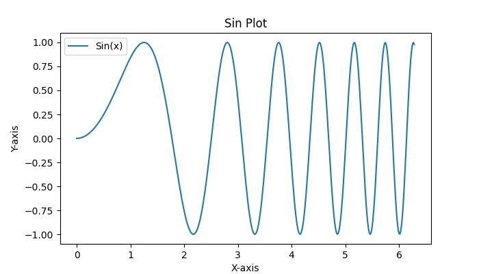
这是一个简单的示例,它向 Axes 添加标签、标题和图例。
import matplotlib.pyplot as plt
import numpy as np

# Sample Data
x = np.linspace(0, 2 * np.pi, 400)
y = np.sin(x**2)

# Create subplots
fig, axs = plt.subplots(figsize=(7,4))

# Draw the plot
axs.plot(x, y, label='Sin(x)')

# Add titles
axs.set_title('Sin Plot')

# Add X and Y labels
axs.set_xlabel('X-axis')
axs.set_ylabel('Y-axis')

# Add legend
axs.legend()

# Show the plot
plt.show()
输出
执行上述代码后,将得到以下输出:
清除 Axes
要清除 axes 的内容,可以使用axes.cla()或axes.clear()方法。
示例
以下示例演示如何在子图中清除第一个 axes。
import matplotlib.pyplot as plt
import numpy as np

# Sample data
x = np.linspace(-1, 1, 10)
y = np.exp(x)

# Creating subplots
fig, (axes1, axes2) = plt.subplots(1, 2, figsize=(7, 4),
   constrained_layout=True)

# Plotting on the first axes
axes1.plot(x, y, c='red')
axes1.set_xlabel("X-axis")        # Set label for X-axis
axes1.set_ylabel("Y-axis")        # Set label for Y-axis
axes1.set_facecolor('lightgreen') # Setting background color
axes1.annotate('axes1', (0.5, 0.5), transform=axes1.transAxes,
   ha='center', va='center', fontsize=18,
   color='darkgrey')

# Adding a title to the second axes
axes2.set_title('Second axes')
axes2.annotate('axes2', (0.5, 0.5), transform=axes2.transAxes,
   ha='center', va='center', fontsize=18,
   color='darkgrey')

# Clearing the first axes
axes1.cla()

# Adding a title to the figure
fig.suptitle('Clearing the Axes')

# Displaying the plot
plt.show()
输出
执行上述代码后,将得到以下输出:
