- Matplotlib 基础
- Matplotlib - 首页
- Matplotlib - 简介
- Matplotlib - 与Seaborn的比较
- Matplotlib - 环境搭建
- Matplotlib - Anaconda发行版
- Matplotlib - Jupyter Notebook
- Matplotlib - Pyplot API
- Matplotlib - 简单绘图
- Matplotlib - 保存图表
- Matplotlib - 标记
- Matplotlib - 图表
- Matplotlib - 样式
- Matplotlib - 图例
- Matplotlib - 颜色
- Matplotlib - 颜色映射
- Matplotlib - 颜色映射归一化
- Matplotlib - 选择颜色映射
- Matplotlib - 颜色条
- Matplotlib - 文本
- Matplotlib - 文本属性
- Matplotlib - 子图标题
- Matplotlib - 图片
- Matplotlib - 图片蒙版
- Matplotlib - 注释
- Matplotlib - 箭头
- Matplotlib - 字体
- Matplotlib - 什么是字体?
- 全局设置字体属性
- Matplotlib - 字体索引
- Matplotlib - 字体属性
- Matplotlib - 比例尺
- Matplotlib - 线性与对数比例尺
- Matplotlib - 对称对数与Logit比例尺
- Matplotlib - LaTeX
- Matplotlib - 什么是LaTeX?
- Matplotlib - LaTeX用于数学表达式
- Matplotlib - 在注释中使用LaTeX文本格式
- Matplotlib - PostScript
- 启用注释中的LaTex渲染
- Matplotlib - 数学表达式
- Matplotlib - 动画
- Matplotlib - 图形对象
- Matplotlib - 使用Cycler进行样式设置
- Matplotlib - 路径
- Matplotlib - 路径效果
- Matplotlib - 变换
- Matplotlib - 刻度和刻度标签
- Matplotlib - 弧度刻度
- Matplotlib - 日期刻度
- Matplotlib - 刻度格式化器
- Matplotlib - 刻度定位器
- Matplotlib - 基本单位
- Matplotlib - 自动缩放
- Matplotlib - 反转坐标轴
- Matplotlib - 对数坐标轴
- Matplotlib - Symlog
- Matplotlib - 单位处理
- Matplotlib - 带单位的椭圆
- Matplotlib - 脊柱
- Matplotlib - 坐标轴范围
- Matplotlib - 坐标轴比例尺
- Matplotlib - 坐标轴刻度
- Matplotlib - 格式化坐标轴
- Matplotlib - Axes 类
- Matplotlib - 双坐标轴
- Matplotlib - Figure 类
- Matplotlib - 多图
- Matplotlib - 网格
- Matplotlib - 面向对象接口
- Matplotlib - PyLab 模块
- Matplotlib - Subplots() 函数
- Matplotlib - Subplot2grid() 函数
- Matplotlib - 固定位置的图形对象
- Matplotlib - 手动等高线
- Matplotlib - 坐标报告
- Matplotlib - AGG 滤镜
- Matplotlib - 矩形带
- Matplotlib - 填充螺旋线
- Matplotlib - findobj 演示
- Matplotlib - 超链接
- Matplotlib - 图片缩略图
- Matplotlib - 使用关键字绘图
- Matplotlib - 创建Logo
- Matplotlib - 多页PDF
- Matplotlib - 多进程
- Matplotlib - 打印标准输出
- Matplotlib - 复合路径
- Matplotlib - Sankey 类
- Matplotlib - MRI 与 EEG
- Matplotlib - 样式表
- Matplotlib - 背景颜色
- Matplotlib - Basemap
- Matplotlib 事件处理
- Matplotlib - 事件处理
- Matplotlib - 关闭事件
- Matplotlib - 鼠标移动
- Matplotlib - 点击事件
- Matplotlib - 滚动事件
- Matplotlib - 按键事件
- Matplotlib - 选择事件
- Matplotlib - 透视镜
- Matplotlib - 路径编辑器
- Matplotlib - 多边形编辑器
- Matplotlib - 定时器
- Matplotlib - Viewlims
- Matplotlib - 缩放窗口
- Matplotlib 小部件
- Matplotlib - 游标小部件
- Matplotlib - 带注释的游标
- Matplotlib - 按钮小部件
- Matplotlib - 复选框
- Matplotlib - 套索选择器
- Matplotlib - 菜单小部件
- Matplotlib - 鼠标游标
- Matplotlib - 多游标
- Matplotlib - 多边形选择器
- Matplotlib - 单选按钮
- Matplotlib - 范围滑块
- Matplotlib - 矩形选择器
- Matplotlib - 椭圆选择器
- Matplotlib - 滑块小部件
- Matplotlib - 区间选择器
- Matplotlib - 文本框
- Matplotlib 绘图
- Matplotlib - 条形图
- Matplotlib - 直方图
- Matplotlib - 饼图
- Matplotlib - 散点图
- Matplotlib - 箱线图
- Matplotlib - 小提琴图
- Matplotlib - 等高线图
- Matplotlib - 3D 绘图
- Matplotlib - 3D 等高线
- Matplotlib - 3D 线框图
- Matplotlib - 3D 表面图
- Matplotlib - 矢羽图
- Matplotlib 有用资源
- Matplotlib - 快速指南
- Matplotlib - 有用资源
- Matplotlib - 讨论
Matplotlib - 坐标轴刻度
什么是坐标轴刻度?
在 Matplotlib 中,坐标轴刻度是指沿坐标轴表示特定数据值的标记。它们有助于理解绘图的比例尺,并为数据可视化提供参考点。让我们深入了解坐标轴刻度的细节 -
坐标轴刻度的关键概念
以下是坐标轴刻度中的关键概念。
主要刻度 - 这些是沿坐标轴上表示重要数据值的突出刻度。
次要刻度 - 这些是主要刻度之间的较小刻度,它们提供了更精细的比例尺,但通常不太突出。
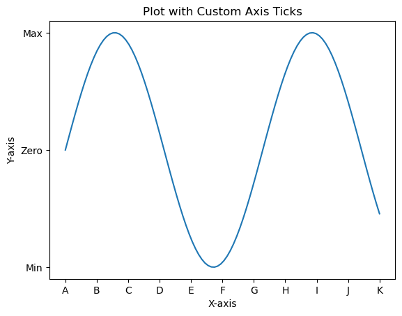
自定义坐标轴刻度
我们可以根据需要自定义绘图上的坐标轴刻度。执行自定义需要遵循以下几个步骤。
设置刻度
我们可以通过两种方式设置坐标轴刻度,一种是手动设置,另一种是自动调整。
手动设置
我们可以使用 plt.xticks() 或 plt.yticks() 函数为坐标轴设置特定的刻度位置和标签。
示例
import matplotlib.pyplot as plt
import numpy as np
x = np.linspace(0, 10, 100)
y = np.sin(x)
plt.plot(x, y)
plt.xlabel('X-axis')
plt.ylabel('Y-axis')
plt.title('Plot with Custom Axis Ticks')
# Customize x-axis ticks
plt.xticks([0, 1, 2, 3, 4, 5, 6, 7, 8, 9, 10], ['A', 'B', 'C', 'D', 'E', 'F', 'G', 'H', 'I', 'J', 'K'])
# Customize y-axis ticks and labels
plt.yticks([-1, 0, 1], ['Min', 'Zero', 'Max'])
plt.show()
输出
自动调整
在 Matplotlib 中,坐标轴刻度的自动调整涉及让库根据数据范围确定刻度的位置和标签。此过程在创建绘图时默认处理,但我们可以使用各种格式选项或调整定位器和格式化程序设置来微调自动调整。以下是与坐标轴刻度自动调整相关的一些方面。
默认自动调整
在此示例中,Matplotlib 根据数据范围自动调整刻度的位置和标签。
示例
import matplotlib.pyplot as plt
# Example data
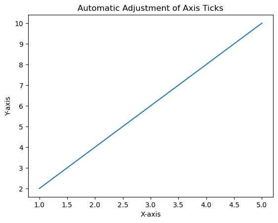
x = [1, 2, 3, 4, 5]
y = [2, 4, 6, 8, 10]
# Creating a plot (automatic adjustment of ticks)
plt.plot(x, y)
plt.xlabel('X-axis')
plt.ylabel('Y-axis')
plt.title('Automatic Adjustment of Axis Ticks')
plt.show()
输出

自定义自动调整
我们可以使用 pyplot 中的几个函数来自动自定义刻度。可以进行这些调整以适应我们数据的性质并提高绘图的可读性。
理解和利用坐标轴刻度的自动调整对于在 Matplotlib 中创建清晰且信息丰富的可视化至关重要。
调整刻度数量
我们可以使用 plt.locator_params(axis='x', nbins=5) 来控制 x 轴上的刻度数量。调整参数 nbins 设置为所需数量。
科学计数法
要以科学计数法显示刻度标签,我们可以使用 plt.ticklabel_format(style='sci', axis='both', scilimits=(min, max))。
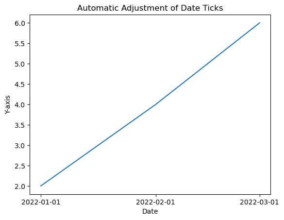
日期刻度(对于时间序列数据)
如果我们处理的是日期/时间数据,那么 Matplotlib 可以自动格式化日期刻度。
示例
在此示例中,我们将自定义自动调整应用于绘图的坐标轴刻度。
import matplotlib.dates as mdates
from datetime import datetime
# Example date data
dates = [datetime(2022, 1, 1), datetime(2022, 2, 1), datetime(2022, 3, 1)]
# Creating a plot with automatic adjustment of date ticks
plt.plot(dates, [2, 4, 6])
# Formatting x-axis as date
plt.gca().xaxis.set_major_locator(mdates.MonthLocator())
plt.gca().xaxis.set_major_formatter(mdates.DateFormatter('%Y-%m-%d'))
plt.xlabel('Date')
plt.ylabel('Y-axis')
plt.title('Automatic Adjustment of Date Ticks')
plt.show()
输出
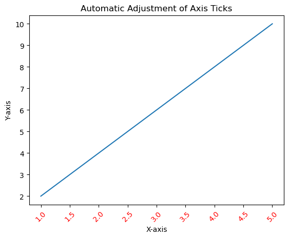
刻度格式
我们可以使用 fontsize、color 和 rotation 参数自定义刻度标签的外观,例如字体大小、颜色和旋转。
示例
import matplotlib.pyplot as plt
# Example data
x = [1, 2, 3, 4, 5]
y = [2, 4, 6, 8, 10]
# Creating a plot (automatic adjustment of ticks)
plt.plot(x, y)
plt.xticks(fontsize=10, color='red', rotation=45)
plt.xlabel('X-axis')
plt.ylabel('Y-axis')
plt.title('Automatic Adjustment of Axis Ticks')
plt.show()
输出
刻度频率和外观
设置刻度频率
我们可以使用 plt.locator_params(axis='x', nbins=5) 来调整刻度的频率,以控制显示的刻度数量。
示例
import matplotlib.pyplot as plt
# Example data
x = [1, 2, 3, 4, 5]
y = [2, 4, 6, 8, 10]
# Creating a plot (automatic adjustment of ticks)
plt.plot(x, y)
plt.locator_params(axis='x', nbins=10)
plt.xlabel('X-axis')
plt.ylabel('Y-axis')
plt.title('Automatic Adjustment of Axis Ticks')
plt.show()
输出
次要刻度
我们可以使用 plt.minorticks_on() 启用次要刻度。我们可以使用 plt.minorticks_on()、plt.minorticks_off() 或通过指定它们的位置来自定义它们的外观。
示例
import matplotlib.pyplot as plt
# Example data
x = [1, 2, 3, 4, 5]
y = [2, 4, 6, 8, 10]
# Creating a plot (automatic adjustment of ticks)
plt.plot(x, y)
plt.minorticks_on()
plt.xlabel('X-axis')
plt.ylabel('Y-axis')
plt.title('Automatic Adjustment of Axis Ticks')
plt.show()
输出

用例
精度控制 - 调整刻度以提供有关数据值的更精确信息。
增强可读性 - 自定义刻度标签和外观以提高可读性。
微调 - 手动设置刻度以强调特定的数据点或区间。
理解和自定义坐标轴刻度对于有效地传达绘图中的信息至关重要,因为它允许我们根据可视化需求调整数据的呈现方式。
添加额外的坐标轴刻度
在此示例中,为了添加额外的刻度,我们使用 xticks() 函数并将刻度范围从 1 到 10 增加到 1 到 20。
示例
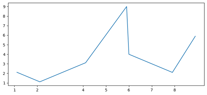
import numpy as np
from matplotlib import pyplot as plt
plt.rcParams["figure.figsize"] = [7.50, 3.50]
plt.rcParams["figure.autolayout"] = True
x = np.linspace(1, 10, 100)
y = np.sin(x)
plt.plot(x, y)
plt.xticks(range(1, 20))
plt.show()
输出

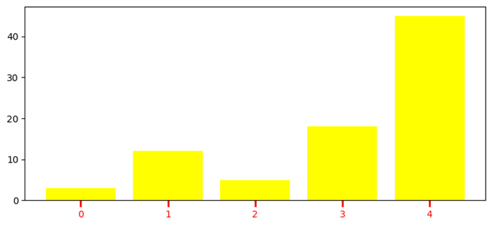
自定义 X 轴刻度
在此示例中,为了添加额外的刻度,我们使用 xticks() 函数并将刻度范围从 1 到 10 增加到 1 到 20。
示例
import numpy as np
import matplotlib.pyplot as plt
plt.rcParams["figure.figsize"] = [7.50, 3.50]
plt.rcParams["figure.autolayout"] = True
height = [3, 12, 5, 18, 45]
bars = ('A', 'B', 'C', 'D', 'E')
y_pos = np.arange(len(bars))
plt.bar(y_pos, height, color='yellow')
plt.tick_params(axis='x', colors='red', direction='out', length=7, width=2)
plt.show()
输出
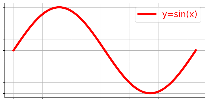
移除 X 轴刻度同时保留网格
要移除 X 刻度同时保留网格,我们可以使用以下代码作为参考。
示例
import matplotlib.pyplot as plt
import numpy as np
plt.rcParams["figure.figsize"] = [7.00, 3.50]
plt.rcParams["figure.autolayout"] = True
x = np.linspace(0, 2*np.pi, 100)
ax = plt.gca()
ax.plot(x, np.sin(x), c='r', lw=5, label='y=sin(x)')
ax.set_xticklabels([])
ax.set_yticklabels([])
ax.grid(True)
plt.legend(loc="upper right")
plt.show()
输出
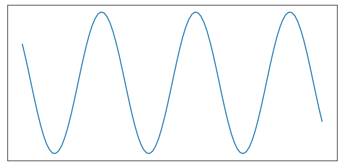
关闭刻度和标记
在此示例中,要关闭 Matplotlib 坐标轴的刻度和标记,我们可以使用 set_tick_params() 来隐藏 X 和 Y 坐标轴标签标记,使用 set_xticks() 和 set_yticks() 来隐藏 X 和 Y 坐标轴刻度标记。
示例
import numpy as np
from matplotlib import pyplot as plt
# Set the figure size
plt.rcParams["figure.figsize"] = [7.00, 3.50]
plt.rcParams["figure.autolayout"] = True
# Create x and y data points
x = np.linspace(-10, 10, 100)
y = np.sin(x)
plt.plot(x, y)
ax = plt.gca()
# Hide X and Y axes label marks
ax.xaxis.set_tick_params(labelbottom=False)
ax.yaxis.set_tick_params(labelleft=False)
# Hide X and Y axes tick marks
ax.set_xticks([])
ax.set_yticks([])
plt.show()
输出
移除坐标轴刻度中的小数点后数字
在此示例中,我们使用 x.astype(int) 函数仅将 x 刻度标签设置为数字。
示例
import matplotlib.pyplot as plt
import numpy as np
plt.rcParams["figure.figsize"] = [7.50, 3.50]
plt.rcParams["figure.autolayout"] = True
x = np.array([1.110, 2.110, 4.110, 5.901, 6.00, 7.90, 8.90])
y = np.array([2.110, 1.110, 3.110, 9.00, 4.001, 2.095, 5.890])
fig, ax = plt.subplots()
ax.plot(x, y)
ax.set_xticks(x.astype(int))
plt.show()
输出
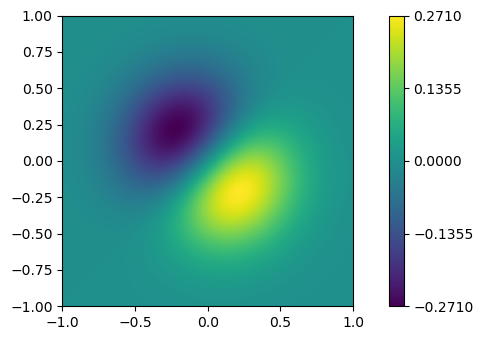
添加 Matplotlib 颜色条刻度
在此示例中,我们为 ScalarMappable 实例 *mappable* 创建一个颜色条,ticks=ticks 用于添加颜色条刻度。
示例
import numpy as np
import matplotlib.pyplot as plt
plt.rcParams["figure.figsize"] = [7.50, 3.50]
plt.rcParams["figure.autolayout"] = True
x, y = np.mgrid[-1:1:100j, -1:1:100j]
z = (x + y) * np.exp(-5.0 * (x ** 2 + y ** 2))
plt.imshow(z, extent=[-1, 1, -1, 1])
ticks = np.linspace(z.min(), z.max(), 5, endpoint=True)
cb = plt.colorbar(ticks=ticks)
plt.show()
输出
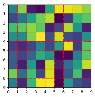
调整 Matplotlib imshow 中的网格线和刻度
在此示例中,我们使用 set_xticklabels 和 set_yticklabels 方法设置 xticklabels 和 yticklabels。
示例
import numpy as np
from matplotlib import pyplot as plt
plt.rcParams["figure.figsize"] = [7.00, 3.50]
plt.rcParams["figure.autolayout"] = True
data = np.random.rand(9, 9)
plt.imshow(data, interpolation="nearest")
ax = plt.gca()
ax.set_xticks(np.arange(-.5, 9, 1))
ax.set_yticks(np.arange(-.5, 9, 1))
ax.set_xticklabels(np.arange(0, 10, 1))
ax.set_yticklabels(np.arange(0, 10, 1))
ax.grid(color='red', linestyle='-.', linewidth=1)
plt.show()
输出
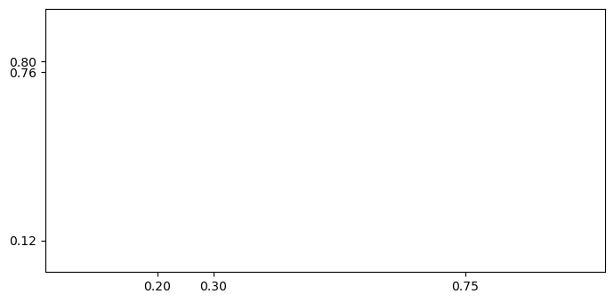
更改刻度之间的间距
在此示例中,我们设置固定位置的刻度或更改 Matplotlib 中刻度之间的间距。
示例
import matplotlib.pyplot as plt
plt.rcParams["figure.figsize"] = [7.00, 3.50]
plt.rcParams["figure.autolayout"] = True
fig, ax = plt.subplots()
xtick_loc = [0.20, 0.75, 0.30]
ytick_loc = [0.12, 0.80, 0.76]
ax.set_xticks(xtick_loc)
ax.set_yticks(ytick_loc)
plt.show()
输出
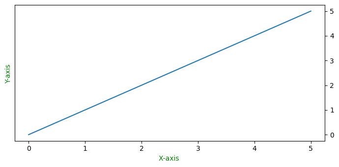
将 Y 轴刻度从绘图的左侧移动到右侧
在此示例中,要将 Y 轴刻度从左侧移到右侧,我们使用 ax.yaxis.tick_right()
示例
from matplotlib import pyplot as plt
import numpy as np
f = plt.figure()
ax = f.add_subplot(111)
ax.yaxis.tick_right()
xpoints = np.array([0, 5])
ypoints = np.array([0, 5])
plt.plot(xpoints, ypoints)
plt.ylabel("Y-axis ")
plt.xlabel("X-axis ")
plt.show()
输出
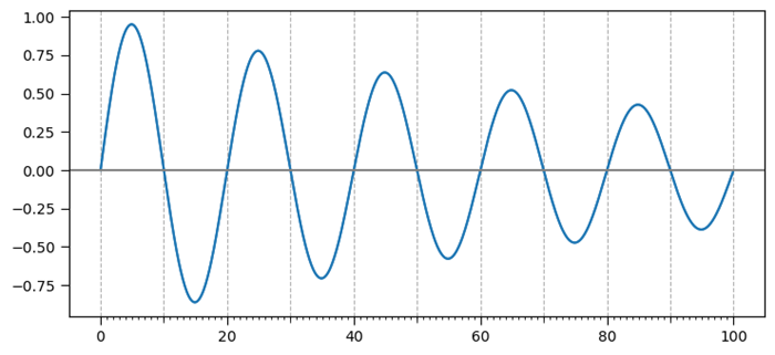
添加第三级刻度
此示例是添加第三级刻度的参考。
示例
import matplotlib.pyplot as plt
import numpy as np
import matplotlib.ticker
plt.rcParams["figure.figsize"] = [7.50, 3.50]
plt.rcParams["figure.autolayout"] = True
t = np.arange(0.0, 100.0, 0.1)
s = np.sin(0.1 * np.pi * t) * np.exp(-t * 0.01)
fig, ax = plt.subplots()
plt.plot(t, s)
ax1 = ax.twiny()
ax1.plot(t, s)
ax1.xaxis.set_ticks_position('bottom')
majors = np.linspace(0, 100, 6)
minors = np.linspace(0, 100, 11)
thirds = np.linspace(0, 100, 101)
ax.xaxis.set_major_locator(matplotlib.ticker.FixedLocator(majors))
ax.xaxis.set_minor_locator(matplotlib.ticker.FixedLocator(minors))
ax1.xaxis.set_major_locator(matplotlib.ticker.FixedLocator([]))
ax1.xaxis.set_minor_locator(matplotlib.ticker.FixedLocator(thirds))
ax1.tick_params(which='minor', length=2)
ax.tick_params(which='minor', length=4)
ax.tick_params(which='major', length=6)
ax.grid(which='both', axis='x', linestyle='--')
plt.axhline(color='gray')
plt.show()
输出
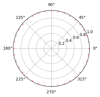
为极坐标图创建次要刻度
此示例是添加第三级刻度的参考。
示例
import numpy as np
import matplotlib.pyplot as plt
# Set the figure size
plt.rcParams["figure.figsize"] = [7.00, 3.50]
plt.rcParams["figure.autolayout"] = True
# radius and theta for the polar plot
r = np.arange(0, 5, 0.1)
theta = 2 * np.pi * r
# Add a subplot
ax = plt.subplot(111, projection='polar')
tick = [ax.get_rmax(), ax.get_rmax() * 0.97]
# Iterate the points between 0 to 360 with step=10
for t in np.deg2rad(np.arange(0, 360, 10)):
   ax.plot([t, t], tick, lw=1, color="red")
# Display the plot
plt.show()
输出
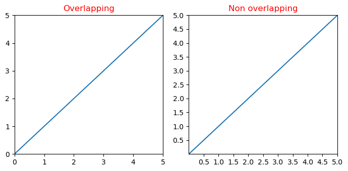
Y 轴刻度标签和 X 轴刻度标签重叠
在此示例中,我们减少了 Matplotlib 中 x 和 y 刻度标签之间重叠的可能性。
示例
import matplotlib.pyplot as plt
from matplotlib.ticker import MaxNLocator
import numpy as np
plt.rcParams["figure.figsize"] = [7.00, 3.50]
plt.rcParams["figure.autolayout"] = True
xs = np.linspace(0, 5, 10)
ys = np.linspace(0, 5, 10)
plt.subplot(121)
plt.margins(x=0, y=0)
plt.plot(xs, ys)
plt.title("Overlapping")
plt.subplot(122)
plt.margins(x=0, y=0)
plt.plot(xs, ys)
plt.title("Non overlapping")
plt.gca().xaxis.set_major_locator(MaxNLocator(prune='lower'))
plt.gca().yaxis.set_major_locator(MaxNLocator(prune='lower'))
plt.show()
输出
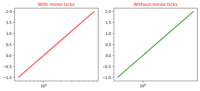
禁用对数图的次要刻度
此示例使用 minorticks_off() 函数禁用 Matplotlib 中对数图的次要刻度。
示例
import numpy as np
from matplotlib import pyplot as plt
plt.rcParams["figure.figsize"] = [7.50, 3.50]
plt.rcParams["figure.autolayout"] = True
x = np.random.randint(-3, 3, 10)
y = np.exp(x)
plt.subplot(121)
plt.plot(y, x, c='red')
plt.xscale('log')
plt.title("With minor ticks")
plt.subplot(122)
plt.plot(y, x, c='green')
plt.xscale('log')
plt.minorticks_off()
plt.title("Without minor ticks")
plt.show()
输出