- Matplotlib 基础
- Matplotlib - 首页
- Matplotlib - 简介
- Matplotlib - 对比 Seaborn
- Matplotlib - 环境设置
- Matplotlib - Anaconda 发行版
- Matplotlib - Jupyter Notebook
- Matplotlib - Pyplot API
- Matplotlib - 简单绘图
- Matplotlib - 保存图形
- Matplotlib - 标记
- Matplotlib - 图形
- Matplotlib - 样式
- Matplotlib - 图例
- Matplotlib - 颜色
- Matplotlib - 色图
- Matplotlib - 色图归一化
- Matplotlib - 选择色图
- Matplotlib - 色标
- Matplotlib - 文本
- Matplotlib - 文本属性
- Matplotlib - 子图标题
- Matplotlib - 图像
- Matplotlib - 图像蒙版
- Matplotlib - 注释
- Matplotlib - 箭头
- Matplotlib - 字体
- Matplotlib - 什么是字体?
- 全局设置字体属性
- Matplotlib - 字体索引
- Matplotlib - 字体属性
- Matplotlib - 刻度
- Matplotlib - 线性和对数刻度
- Matplotlib - 对称对数和 Logit 刻度
- Matplotlib - LaTeX
- Matplotlib - 什么是 LaTeX?
- Matplotlib - LaTeX 用于数学表达式
- Matplotlib - LaTeX 在注释中的文本格式
- Matplotlib - PostScript
- 在注释中启用 LaTeX 渲染
- Matplotlib - 数学表达式
- Matplotlib - 动画
- Matplotlib - 图形对象
- Matplotlib - 使用 Cycler 进行样式设置
- Matplotlib - 路径
- Matplotlib - 路径效果
- Matplotlib - 变换
- Matplotlib - 刻度和刻度标签
- Matplotlib - 弧度刻度
- Matplotlib - 日期刻度
- Matplotlib - 刻度格式化器
- Matplotlib - 刻度定位器
- Matplotlib - 基本单位
- Matplotlib - 自动缩放
- Matplotlib - 反转轴
- Matplotlib - 对数轴
- Matplotlib - Symlog
- Matplotlib - 单位处理
- Matplotlib - 带单位的椭圆
- Matplotlib - 脊柱
- Matplotlib - 轴范围
- Matplotlib - 轴刻度
- Matplotlib - 轴刻度
- Matplotlib - 格式化轴
- Matplotlib - Axes 类
- Matplotlib - 双轴
- Matplotlib - Figure 类
- Matplotlib - 多图
- Matplotlib - 网格
- Matplotlib - 面向对象接口
- Matplotlib - PyLab 模块
- Matplotlib - Subplots() 函数
- Matplotlib - Subplot2grid() 函数
- Matplotlib - 固定图形对象
- Matplotlib - 手动等值线
- Matplotlib - 坐标报告
- Matplotlib - AGG 过滤器
- Matplotlib - 带状框
- Matplotlib - 填充螺旋线
- Matplotlib - Findobj 演示
- Matplotlib - 超链接
- Matplotlib - 图像缩略图
- Matplotlib - 使用关键字绘图
- Matplotlib - 创建 Logo
- Matplotlib - 多页 PDF
- Matplotlib - 多进程
- Matplotlib - 打印标准输出
- Matplotlib - 复合路径
- Matplotlib - Sankey 类
- Matplotlib - MRI 与 EEG
- Matplotlib - 样式表
- Matplotlib - 背景颜色
- Matplotlib - Basemap
- Matplotlib 事件处理
- Matplotlib - 事件处理
- Matplotlib - 关闭事件
- Matplotlib - 鼠标移动
- Matplotlib - 点击事件
- Matplotlib - 滚动事件
- Matplotlib - 按键事件
- Matplotlib - 选择事件
- Matplotlib - 透镜
- Matplotlib - 路径编辑器
- Matplotlib - 多边形编辑器
- Matplotlib - 定时器
- Matplotlib - Viewlims
- Matplotlib - 缩放窗口
- Matplotlib 小部件
- Matplotlib - 游标小部件
- Matplotlib - 带注释的游标
- Matplotlib - 按钮小部件
- Matplotlib - 复选框
- Matplotlib - 套索选择器
- Matplotlib - 菜单小部件
- Matplotlib - 鼠标游标
- Matplotlib - 多游标
- Matplotlib - 多边形选择器
- Matplotlib - 单选按钮
- Matplotlib - 范围滑块
- Matplotlib - 矩形选择器
- Matplotlib - 椭圆选择器
- Matplotlib - 滑块小部件
- Matplotlib - 跨度选择器
- Matplotlib - 文本框
- Matplotlib 绘图
- Matplotlib - 条形图
- Matplotlib - 直方图
- Matplotlib - 饼图
- Matplotlib - 散点图
- Matplotlib - 箱线图
- Matplotlib - 小提琴图
- Matplotlib - 等值线图
- Matplotlib - 3D 绘图
- Matplotlib - 3D 等值线
- Matplotlib - 3D 线框图
- Matplotlib - 3D 曲面图
- Matplotlib - Quiver 图
- Matplotlib 有用资源
- Matplotlib - 快速指南
- Matplotlib - 有用资源
- Matplotlib - 讨论
Matplotlib - 颜色
Matplotlib 提供了多种管理绘图中颜色的选项,使用户能够增强视觉效果并有效地传达信息。
颜色可以设置为绘图中不同元素的颜色,例如线条、标记和填充区域。例如,在绘制数据时,可以使用 color 参数指定线条颜色。类似地,散点图允许为各个点设置颜色。下图显示了绘图中不同元素的颜色 -

Matplotlib 中的颜色表示格式
Matplotlib 支持多种表示颜色的格式,包括 -
RGB 或 RGBA 元组
十六进制 RGB 或 RGBA 字符串
灰度级字符串
"Cn" 颜色规范
命名颜色
以下是关于每种格式的简要讨论以及相应的示例。
RGB 或 RGBA 元组格式
您可以使用范围在 [0, 1] 之间的浮点值元组来表示红色、绿色、蓝色和 Alpha(透明度)值。例如:(0.1, 0.2, 0.5) 或 (0.1, 0.2, 0.5, 0.3)。
示例
以下示例演示了如何使用 RGB 或 RGBA 元组指定绘图的面颜色。
import matplotlib.pyplot as plt
import numpy as np

# sample data
t = np.linspace(0.0, 2.0, 201)
s = np.sin(2 * np.pi * t)

# RGB tuple for specifying facecolor
fig, ax = plt.subplots(figsize=(7,4), facecolor=(.18, .31, .31))

# Plotting the data
plt.plot(t, s)

# Show the plot
plt.show()
print('successfully used the RGB tuple for specifying colors..')
输出
执行上述代码后,我们将得到以下输出 -

successfully used the RGB tuple for specifying colors..
十六进制 RGB 或 RGBA 字符串格式
可以使用表示大小写不敏感的十六进制 RGB 或 RGBA 的字符串,例如:'#0F0F0F' 或 '#0F0F0F0F' 来在 matplotlib 中指定颜色。
示例
此示例使用十六进制字符串来指定轴面颜色。
import matplotlib.pyplot as plt
import numpy as np

# Example data
t = np.linspace(0.0, 2.0, 201)
s = np.sin(2 * np.pi * t)

# Hex string for specifying axis facecolor
fig, ax = plt.subplots(figsize=(7,4))
ax.set_facecolor('#eafff5')

# Plotting the data
plt.plot(t, s)

# Show the plot
plt.show()
print('successfully used the Hex string for specifying colors..')
输出
执行上述代码后,我们将得到以下输出 -

successfully used the Hex string for specifying colors..
此外,可以使用简写十六进制 RGB 或 RGBA 字符串(大小写不敏感)来在 matplotlib 中指定颜色。它们等效于重复字符的十六进制简写。例如:'#abc'(等效于 '#aabbcc')或 '#abcd'(等效于 '#aabbccdd')。
灰度级字符串格式
我们可以使用范围在 [0, 1](含)内的浮点值的字符串表示形式来表示灰度级。例如,“0”表示黑色,“1”表示白色,“0.8”表示浅灰色。
示例
这是一个使用灰度级字符串指定标题颜色的示例。
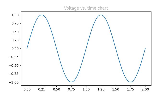
import matplotlib.pyplot as plt
import numpy as np

# Example data
t = np.linspace(0.0, 2.0, 201)
s = np.sin(2 * np.pi * t)

# create a plot
fig, ax = plt.subplots(figsize=(7,4))

# Plotting the data
plt.plot(t, s)

# using the Gray level string for specifying title color
ax.set_title('Voltage vs. time chart', color='0.7')

# Show the plot
plt.show()
print('successfully used the Gray level string for specifying colors..')
输出
执行上述代码后,我们将得到以下输出 -
successfully used the Gray level string for specifying colors..
"Cn" 颜色表示法
可以使用“Cn”颜色规范,即“C”后跟一个数字,该数字是默认属性循环(rcParams["axes.prop_cycle"])中的索引来在 matplotlib 中指定颜色。
示例
在此示例中,使用 Cn 表示法(color='C1')绘制图形,该表示法对应于默认属性循环中的第 2 种颜色。
import matplotlib.pyplot as plt
import numpy as np

# Example data
t = np.linspace(0.0, 2.0, 201)
s = np.sin(2 * np.pi * t)

# create a plot
fig, ax = plt.subplots(figsize=(7,4))

# Cn notation for plot
ax.plot(t, .7*s, color='C1', linestyle='--')

# Show the plot
plt.show()
print('successfully used the Cn notation for specifying colors..')
输出
执行上述代码后,我们将得到以下输出 -

successfully used the Cn notation for specifying colors..
单字母字符串格式
在 Matplotlib 中,单字母字符串用作表示一组基本颜色的简写符号。这些简写符号是作为matplotlib.colors.BASE_COLORS容器中的字典提供的基本颜色的一部分。每个字母对应于特定的颜色。
单字母简写符号包括:“b”:蓝色,“g”:绿色,“r”:红色,“c”:青色,“m”:洋红色,“y”:黄色,“k”:黑色和“w”:白色。
示例
在此示例中,每个基本颜色都以其相应的单字母简写符号绘制为条形。
import matplotlib.pyplot as plt
import matplotlib.colors as mcolors
import numpy as np

# Get the base colors and their names
base_colors = mcolors.BASE_COLORS
color_names = list(base_colors.keys())

# Create a figure and axis
fig, ax = plt.subplots(figsize=(7, 4))

# Plot each color as a bar
for i, color_name in enumerate(color_names):
   ax.bar(i, 1, color=base_colors[color_name], label=color_name)

# Set the x-axis ticks and labels
ax.set_xticks(np.arange(len(color_names)))
ax.set_xticklabels(color_names)

# Set labels and title
ax.set_title('Base Colors')

# Add legend
ax.legend()

# Show the plot
plt.show()
print('Successfully visualized all the available base colors..')
输出
执行上述代码后,我们将得到以下输出 -

Successfully visualized all the available base colors..
其他格式
此外,我们可以使用带有“xkcd:”前缀的xkcd 颜色调查中的大小写不敏感颜色名称、X11/CSS4(“html”)颜色名称和Tableau 颜色。
示例
这是一个演示在 Matplotlib 绘图中使用不同颜色格式(包括 X11/CSS4 颜色、xkcd 颜色和 Tableau 颜色)的示例。
import matplotlib.pyplot as plt
import numpy as np

# Example data
t = np.linspace(0.0, 2.0, 201)
s = np.sin(2 * np.pi * t)

# create a plot
fig, ax = plt.subplots(figsize=(7, 4))

# Plotting the data
plt.plot(t, s)

# 5) a named color:
ax.set_ylabel('Specifying color using the X11/CSS4 name', color='peachpuff')

# 6) a named xkcd color:
ax.set_xlabel('Specifying color name from the xkcd color survey', color='xkcd:crimson')

# 8) tab notation:
ax.set_title('Specifying color using the Tableau Colors', color='tab:orange')

plt.show()
print('Successfully used the X11/CSS4, xkcd, and Tableau Colors formats...')
输出
执行上述代码后,我们将得到以下输出 -

Successfully used the X11/CSS4, xkcd, and Tableau Colors formats...
使颜色变暗或变亮
要使任何颜色变暗或变亮,可以使用 plot() 方法的 alpha 参数,alpha 值越大,颜色越暗,值越小,颜色越亮。
示例
这是一个创建两条具有不同 alpha 值的线条的绘图的示例,以复制线条的更暗和更亮的色调。
import numpy as np
from matplotlib import pyplot as plt

# Sample data
xs = np.linspace(-2, 2, 100)
ys = np.sin(xs)

# Create a figure
fig, ax = plt.subplots(figsize=(7, 4))

# plot two lines with different alpha values
ax.plot(xs, ys, c='red', lw=10, label="Darken")
ax.plot(xs+.75, ys+.75, c='red', lw=10, alpha=0.3, label="Lighten")
ax.legend(loc='upper left')

plt.show()
输出
执行上述代码后,我们将得到以下输出 -
